Try X Answer
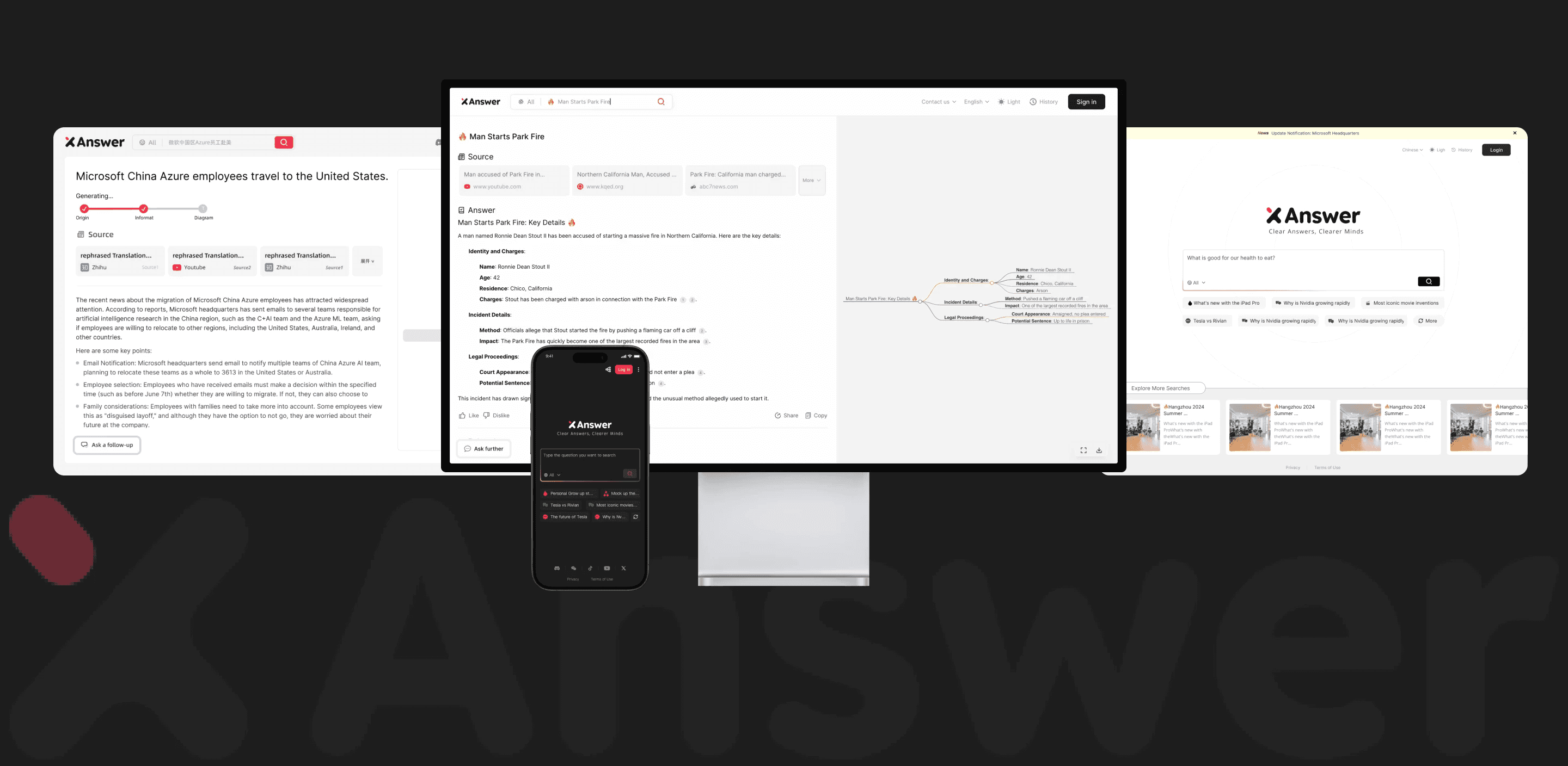
"In 2024, searching for information online felt empowering, but users became overwhelmed by competing tools as options grew. I took on a project to redefine the search experience, focusing on creating a unique, AI-driven platform that simplifies search results into mind maps and presentations, offering a new level of clarity and efficiency. "
Role
UX Researcher
UX Designer
Visual Designer
Platform
Responsive Web
Responsive Mobile
Timeframe
3 months
Team
Ai Business Design Team
OVERVIEW
Background
Context
In 2024, Alibaba International Digital Commerce Group began developing the Xanswer model as a new AI-powered tool for general search targeting the global market. As a design intern, I worked on shaping the product strategy, gathering user insights, prototyping, and delivering visual designs from 0-1.
Stakeholders: Cross-team Collaboration
Our team has five engineers, four marketers, two designers, and a contractor who helped finalize the project design. My mentor is the leader of the AIB Design Group and we meet individually twice a week to discuss project progress. We also have a group meeting once a week to learn about other people’s project content.
Problem
: How can we make us stand out in a competitive market?
Solutions:
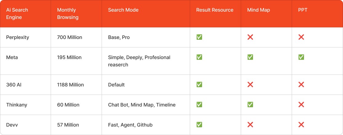
Implementing AI Text Output, Mind Mapping, and PPT Features in a Single Product.
Conduct a competitive analysis and enhance user engagement through visual micro-interactions.
Multilingual interaction expands user scope.
Impact&Result
We collected user feedback three months after it was launched and got very good feedback. Users appreciate the seamless integration of AI tools, which greatly streamlines their workflows, with many reporting increased productivity and overall user experience satisfaction.
2.5w+
Actual User Growth
80%+
30%+
User Day Retention Rate
After launched 3 month
UXD Process
Context: Receiving the product requirements from the stakeholders
Stakeholders did the competitive analysis / synthesised customer feedback from different sources
When I received the project, the stakeholders had already conducted extensive market research and shared their findings with me. My task was to consolidate this information, integrating key insights into the design process.
A Free Search Engine
Target User group



Since the product is targeted at users in the US, I focused on professional demographics who frequently work with data, presentations, and idea organization.
After identifying key industries like business, education, and research, we determined that the ideal user group would be individuals aged 25-45, as they are more likely to engage in these activities regularly.
Key User Insights
Through a combination of user interviews and observational research, I gathered insights by speaking with target users like marketing managers, graduate students, and product managers. These sessions revealed key pain points, such as the inefficiency of manually creating presentations and mind maps, the frustration of switching between multiple tools, and the desire for more personalized and integrated workflows.
Time Efficiency Matters
Users value tools that save them time by automating repetitive tasks like creating presentations and mind maps from search results.
Seamless Integration Across Tools
Users prefer a tool that can consolidate tasks within a single platform, reducing the need to switch between multiple applications.
Customization and Personalization
Users appreciate features that allow them to tailor outputs like presentations and mind maps to their specific needs, enhancing usability and relevance.
Brainstorming Sessions
We collaborated with the engineering team to assess the technical feasibility of our key features, such as AI-generated search templates, mind map visualization, and seamless PPT integration, helping us prioritize the most impactful features.

Technical Feasibility (Engineering):
Since it's my first time working with this team, I need to evaluate the feasibility of implementing front-end and back-end algorithms to ensure accurate execution of the design. After consulting with the marketing team, I've identified three technical feasibility points to discuss with the engineers.
Responsive Design Rules
The product requires mobile and PC versions for browsing. I need to determine the best method or size for engineers to write code.
Loading Status & Generate Time
The loading status is based on how long the AI model takes to generate output. The design animation will also vary based on the time taken.
Outside Resources
Engineers need to ensure that we can connect external resources to our findings, which helps to clarify the layout and content of the results.
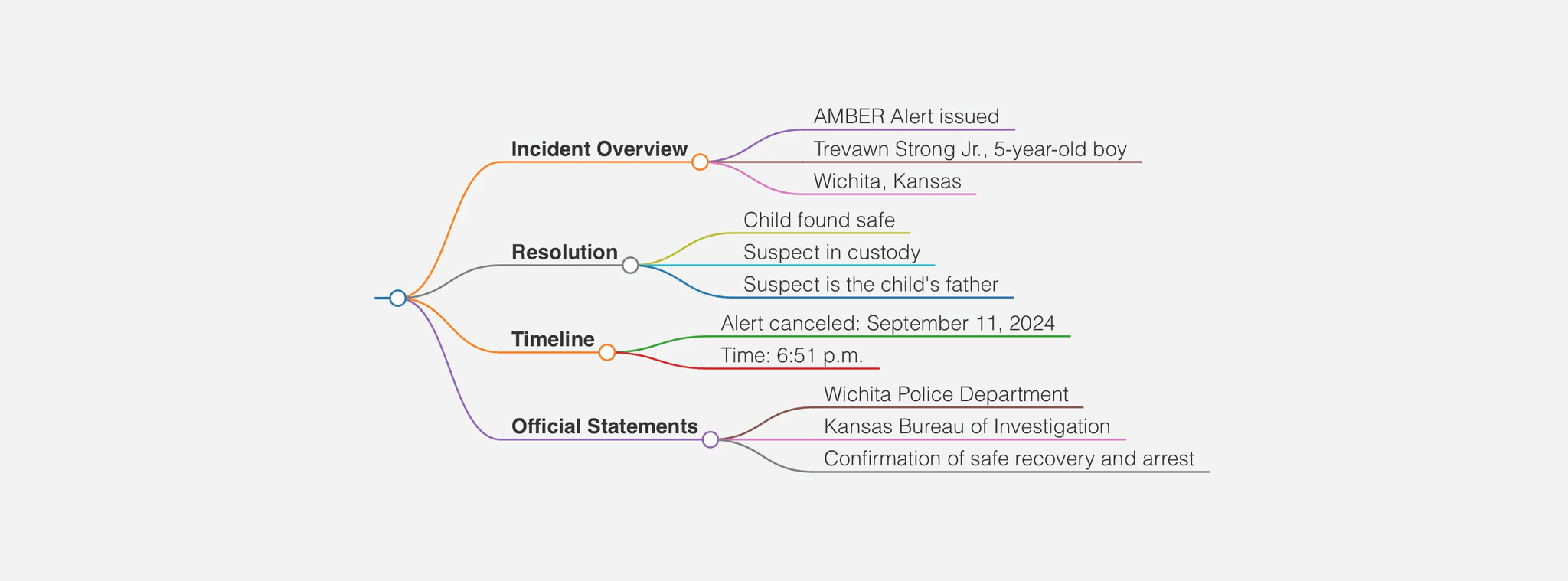
Algorithm testing technical feasibility
Key Features
I identified and prioritized the key features for our AI search tool based on both user needs and technical feasibility. By working closely with the front-end team, I ensured that these features not only function efficiently but also offer a smooth and intuitive user experience that aligns with the goals of the marketing team to drive user engagement and adoption.
Accurate Answer
The algorithm's instructions determine the hierarchy of answer, which helps in designing titles, subtitles, and resource components, overall layout to provide clear answers to users.
Result Management
After finding a satisfactory result, we allowed users to share the result or mind map as an image or screenshot with the X answer logo with their friends, or save it on their local device.
Key Prioritisation
As we move forward with the project, we've prioritized key features based on user impact and technical feasibility. We've taken a comprehensive approach to ensure the highest value and short-term achievability. Then, I'll move on to the design phase.

Phase1
Conceptual Design
During Phase 1 of the design process, I focused on creating a low-fidelity prototype and defining the information architecture (IA) to establish the core structure and functionality. I collaborated closely with the marketing team to confirm the layout of output results and functionality. We aligned on the core objectives of the product, discussing user needs, feature priorities, and how best to communicate the product’s value.
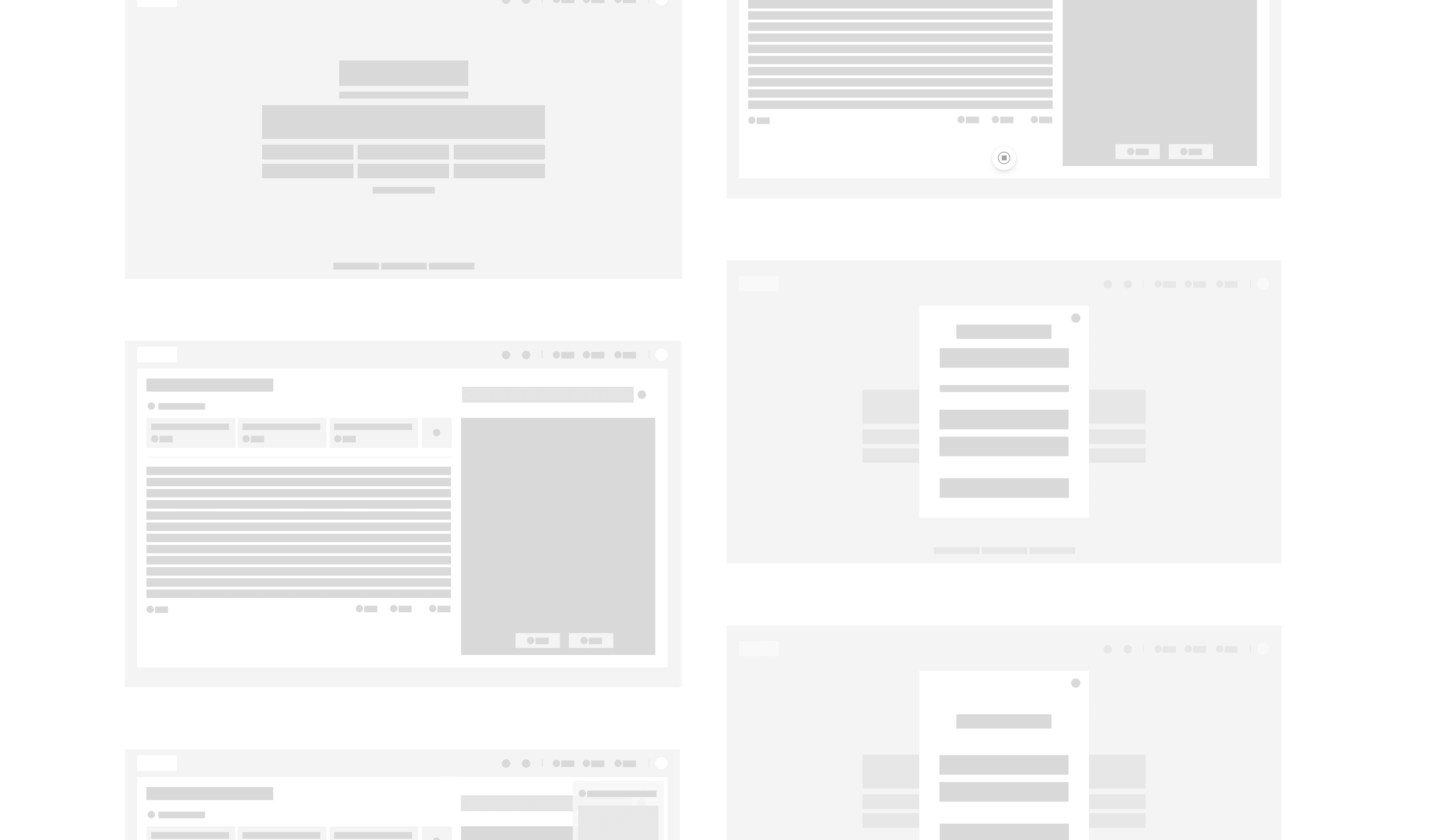
Internal Beta and Iterations
For internal testing of the low-fidelity prototype, we took a structured approach to gather feedback and validate core design elements. A team-wide review was conducted with designers, developers, and stakeholders to test basic user flows, navigation, and usability. I created test scenarios based on real user feedback, simulating typical user interactions.
Before
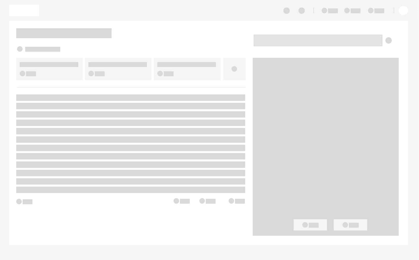
The combination of letters and mind maps made users confused and nowhere to place the search bar.
After
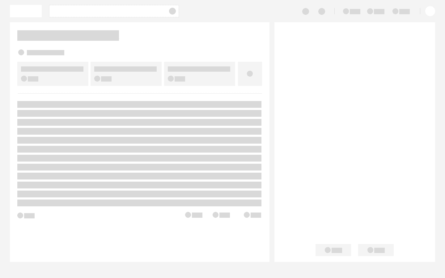
We decide to split the generated content into two parts: Font Part and Mind Map, which allows the user to manage their results clearly.
Before
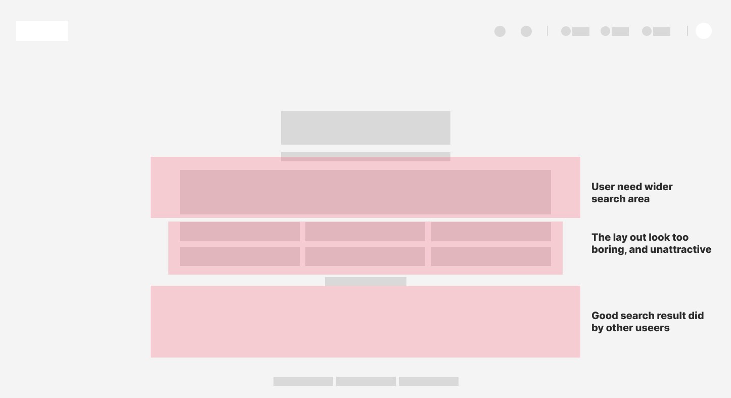
The search box takes up less than 5% of the screen, and the overall layout is too regular to attract users.
After
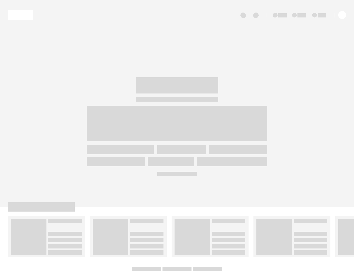
We’ve added more examples of good search content, criss-crossed the cards, and made the search box larger so users can focus on their search.
Dark & Light Mode Design System
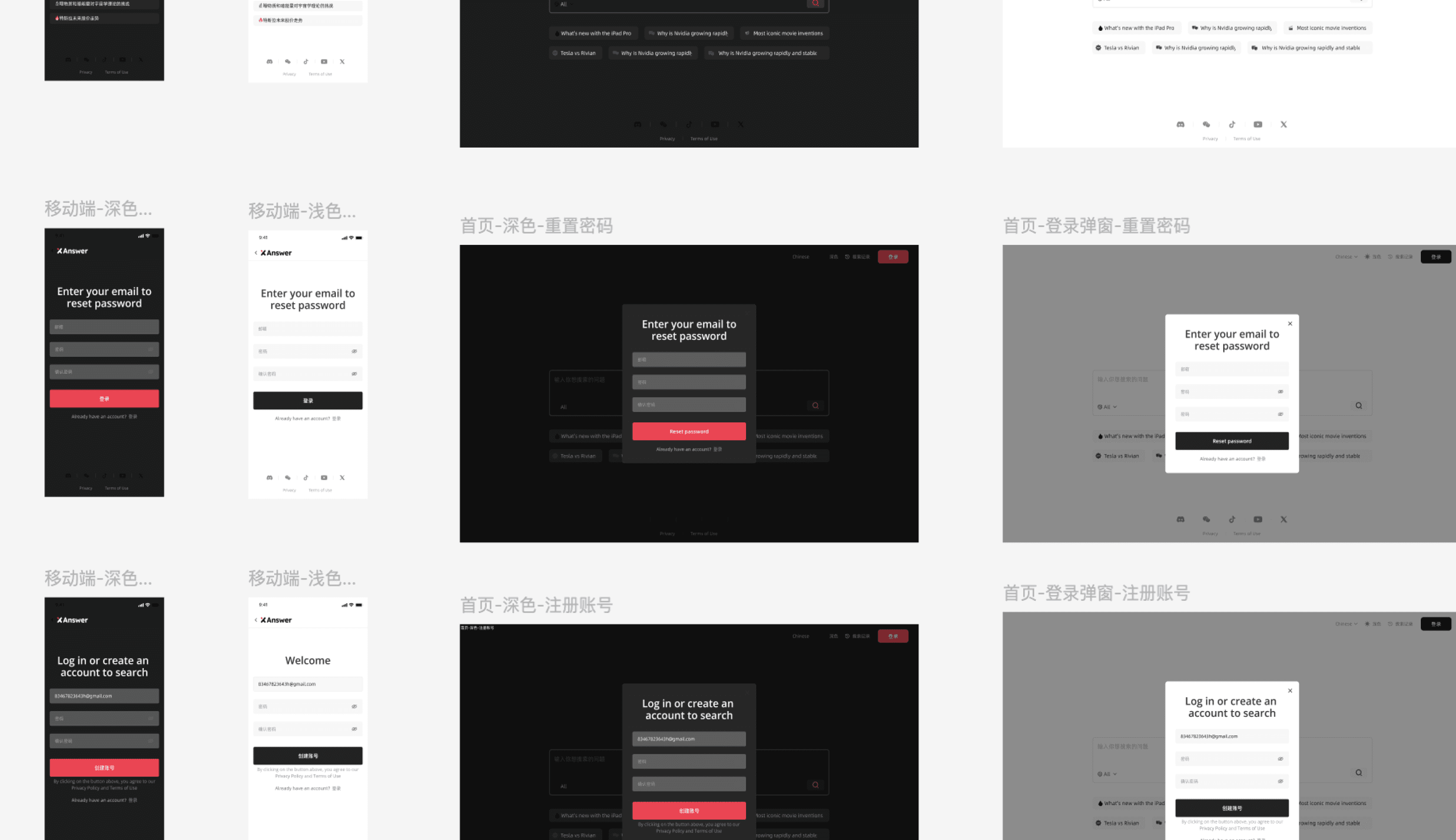
After the low-fi prototype, the contractor and I implemented responsive components for web and mobile, ensuring seamless support for dark and light modes. We developed an accessible color scheme for readability and contrast in both modes, using CSS variables for dynamic theme switching. We rigorously tested across devices and browsers, making necessary adjustments to ensure flawless performance.
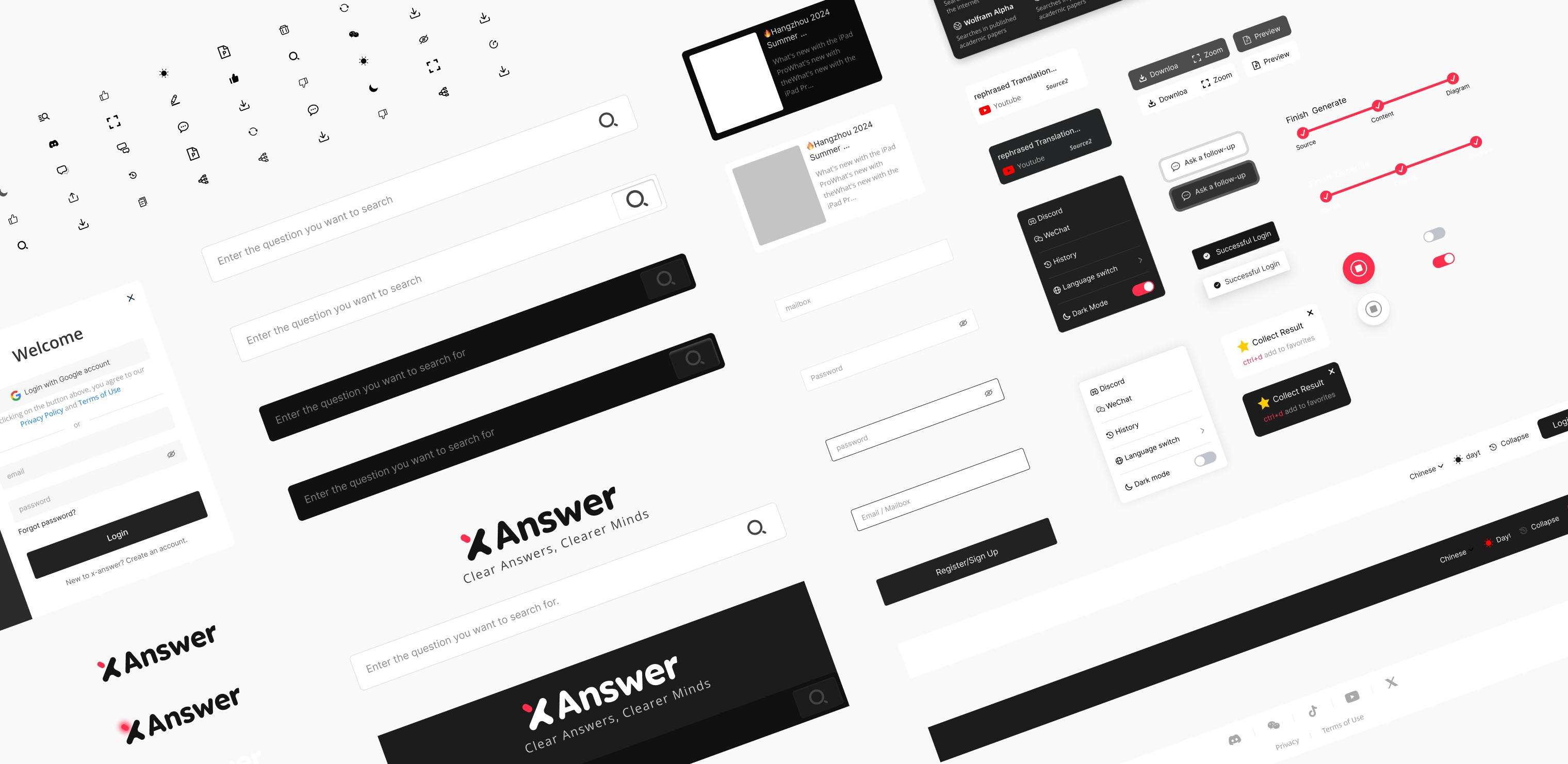
Responsive Design
Then we delivered a mobile-responsive design based on a high-fi prototype and tested it with an engineer to ensure smooth responsiveness. We continuously tested the web version on different size devices to verify that the user experience remained intuitive, with consistent functionality and appearance regardless of screen size.
Launch Beta Version With Engineer
We conducted multiple rounds of pre-launch testing, resolving final bugs and inconsistencies to ensure a smooth user experience. After the beta launch, we used Google Clarity to collect real-time data on user behavior, tracking metrics like heatmaps, session recordings, and engagement. Based on these insights, I collaborated with the engineering team to make necessary adjustments, ensuring a polished, user-centered final product in Design Phase2.
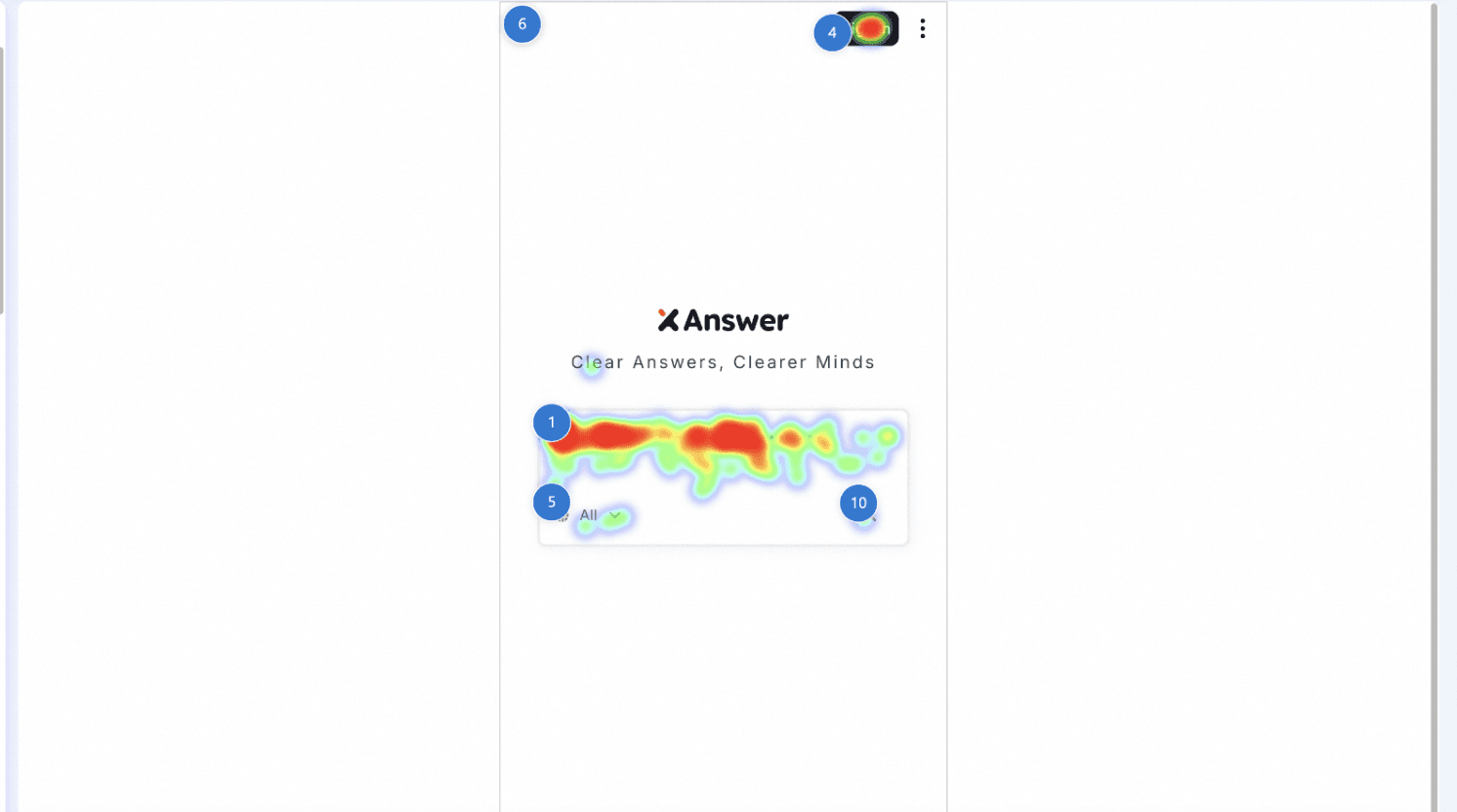
Mobile Heatmap
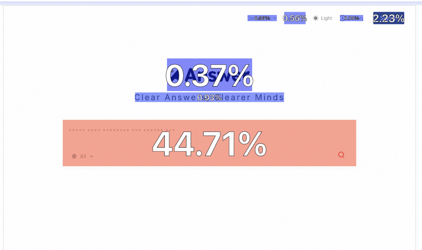
Web Clickable Map
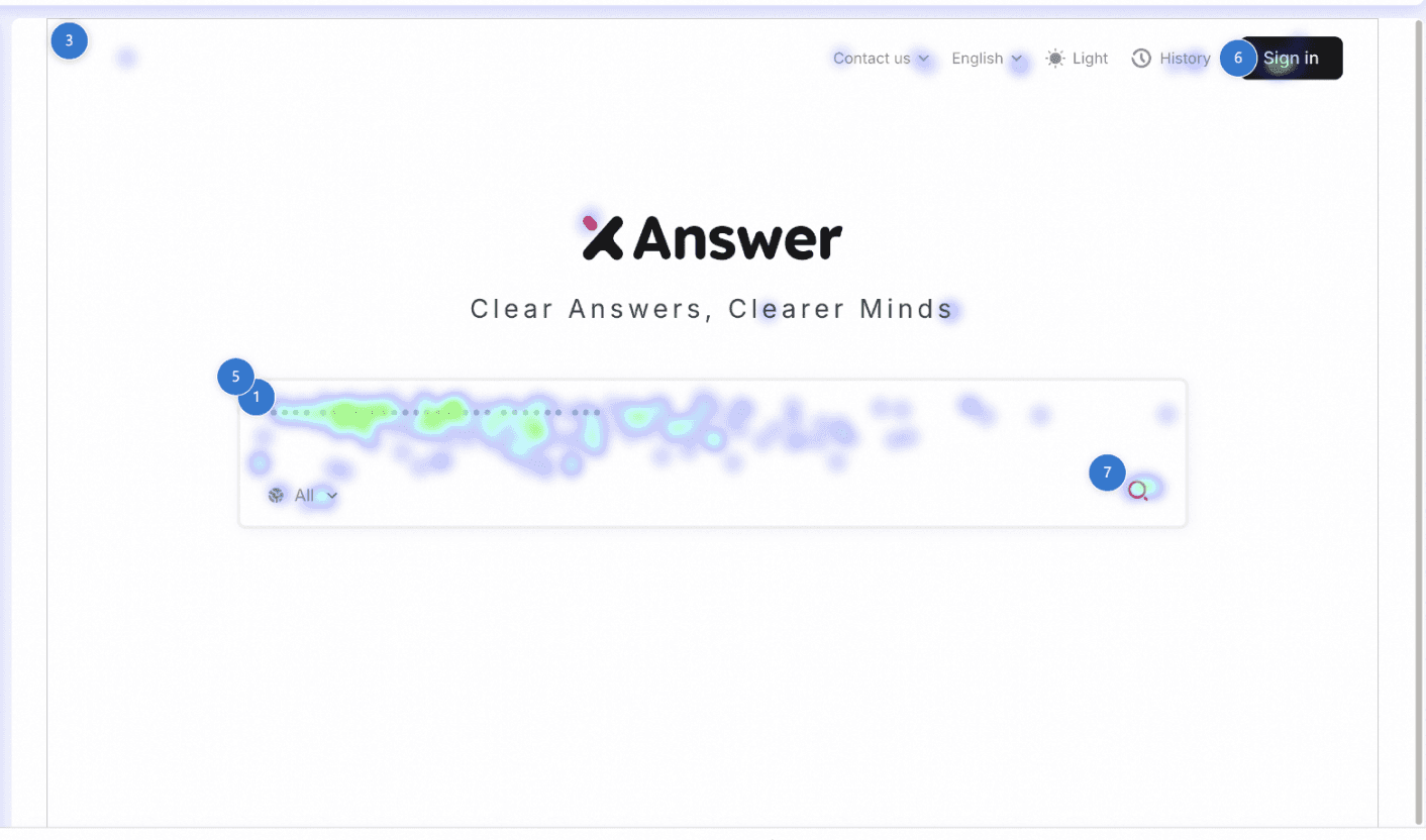
Web Heatmap
Phase 2
Customer Feedback for 1.0
After the first iteration of the product was launched, we collected user feedback from comments on promotional posts across various online platforms. Users praised specific features, while also pointing out areas needing improvement.
“Love the AI-generated PPT feature! Saved me hours on my last report 💡”
"Mind map tool is super useful, but could use more customization options."
"X Answer has made my research process so much faster! ⏳"
"The search results are great, but I’d like to see more tailored suggestions."
"The search results are great, but I’d like to see more tailored suggestions."
"Good overall, but a bit slow on mobile devices sometimes."
"The integration with different data sources is spot on. So helpful!"
"Good overall, but a bit slow on mobile devices sometimes."
"The integration with different data sources is spot on. So helpful!"
"Perfect tool for creating presentations quickly! 🚀"
"Great for organizing info into mind maps. Really smooth experience!"
"Really impressed with the visual generation feature! 🤩"
"Turning search results into presentations is a time-saver! 🕒"
"Turning search results into presentations is a time-saver! 🕒"
User insights based on 1.0 user feedback
By analyzing these comments, we identified key user needs and frustrations, which informed the core focus for the second iteration of the product.
Uncertainty about how to search
This confusion stemmed from a lack of clear guidance on using the AI-powered search engine, leading to low search click-through rates.
Unknown Completion Time
Users reported frustration with the lack of clear feedback on how long it would take for the AI to produce search results and mind map.
Save the Result or Share to Others
Users have expressed uncertainty about how to save or share the AI-generated results with others.
More design iterations based on real user data from the Beta version
After collecting real user data from the beta version, I proceeded with additional design iterations. Once I confirmed the timeline with the front-end team, I implemented several key updates.
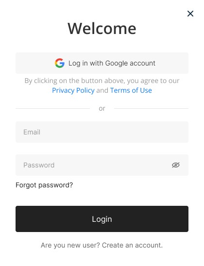
Before
Log in and Sign in
Before logging in, users should be aware that our main function is Ai MindMaps.
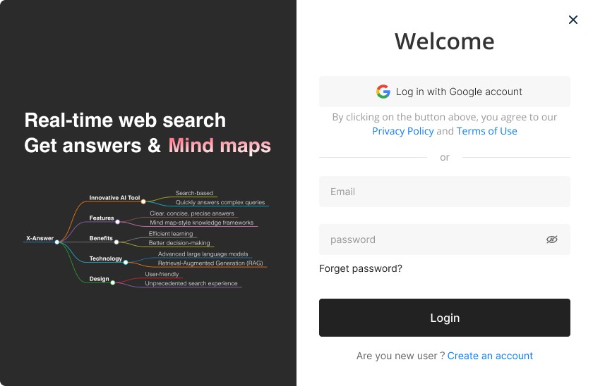
After
Smart tokens & styles
Prime is tailored to use real design system tokens structure, with
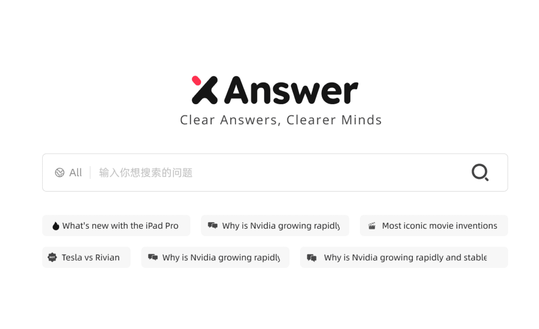
Before
Flat Design of Search Bar
The flat design of the homepage search bar has resulted in low search volume.
After
Micro Interaction on Search Bar
I coded css animations to provide users with micro-interaction guidance at every step.
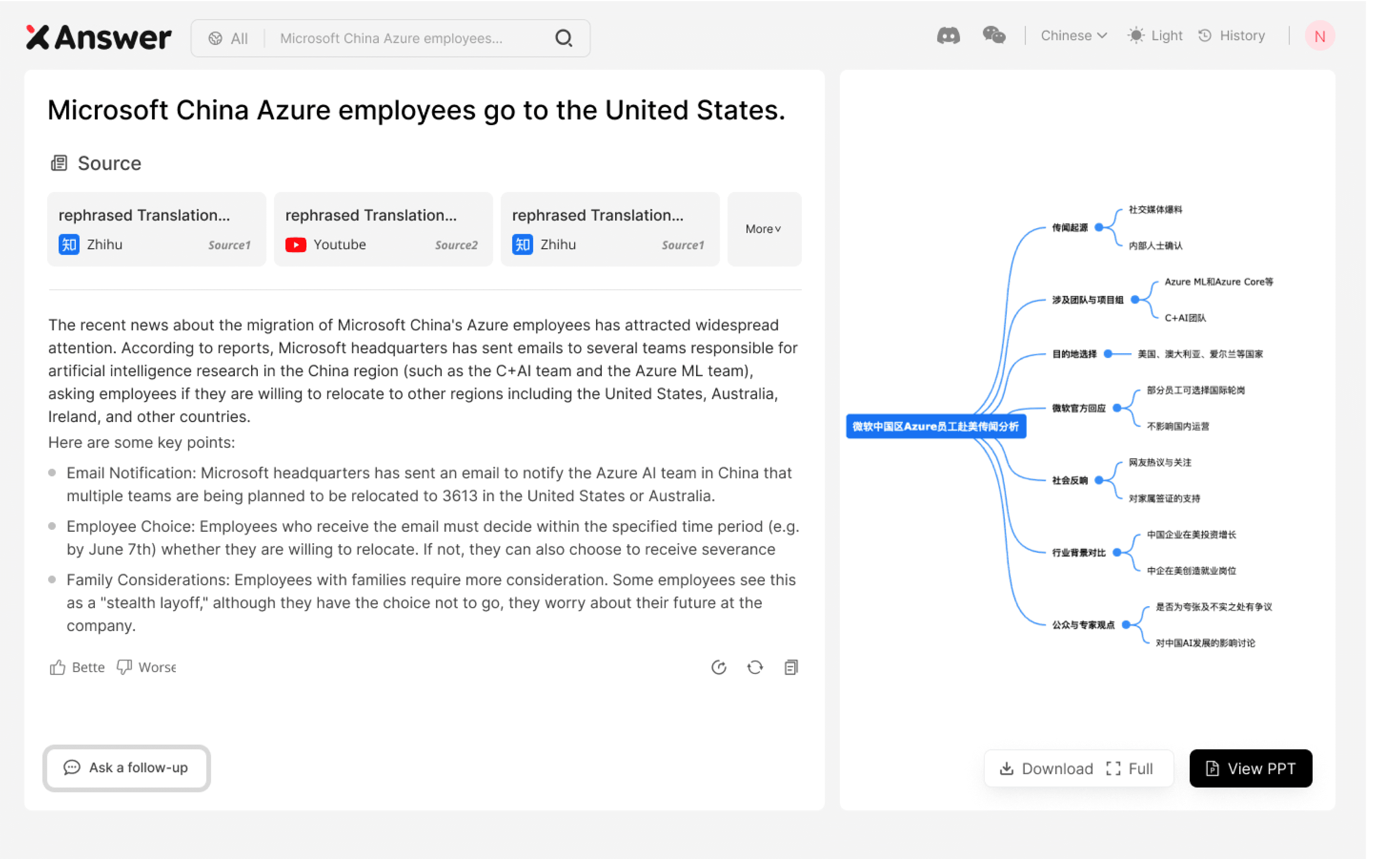
Before
Unknown Generating Time
There is a lack of progress guidance during the generation process, and users leave directly without waiting for the results.
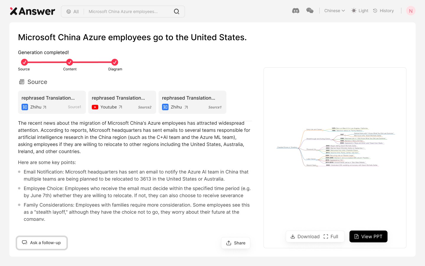
After
Generating Progress and Layout Redefine
After adding the progress bar, the time for generating mind maps and text can be clarified through re-layout.
