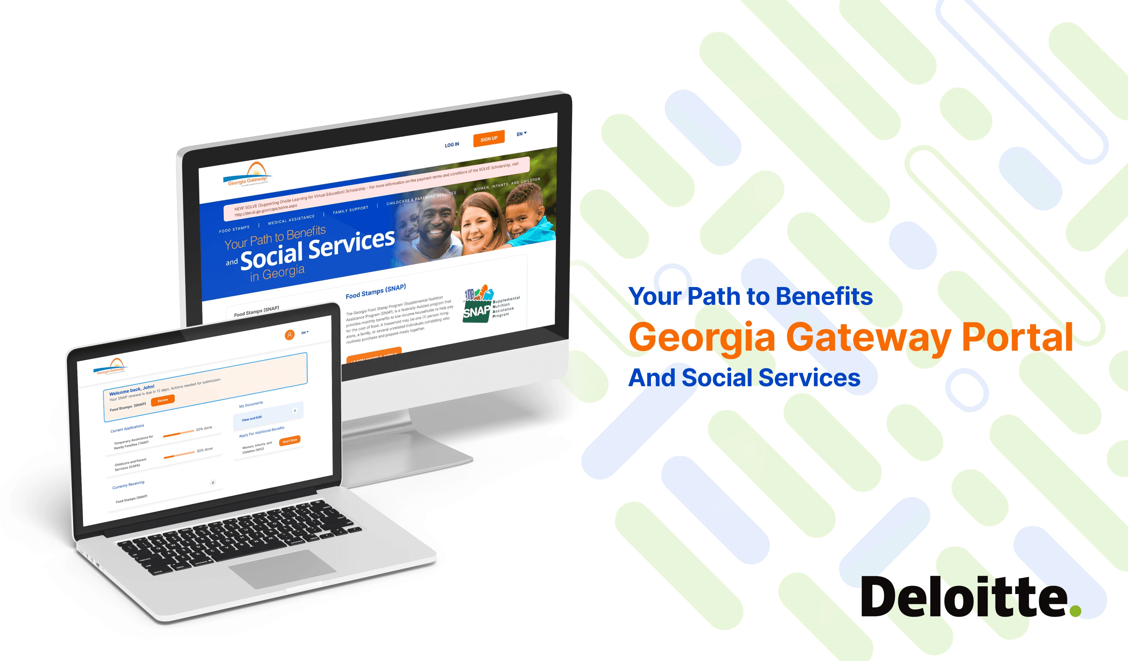
Redefine Georgia Gateway Portal
Users from diverse backgrounds struggle to navigate the Georgia Gateway Portal due to its complex interface, leading to confusion, delays, and incomplete applications.
Our 10-member design team includes a UX researcher, a UX designer, and a UI designer. I work closely with my mentor, who is the project manager. Our challenge was to simplify the experience, improve clarity, and ensure the platform meets the needs of users with limited digital literacy or English proficiency.
[Project Overview]
The Georgia Gateway Portal is a crucial access point for individuals applying for public assistance programs like SNAP, Medicaid, and TANF.
Industry
Government Portal
My Role
UXUI Designer
Tools
Figma Photoshop Illustrator
Timeline
Jan 2022 - April 2022
x3
Application time reduced 3 times than before
x1
The successful submission rate for first-time users
+40%
User satisfaction based on post-test surveys.
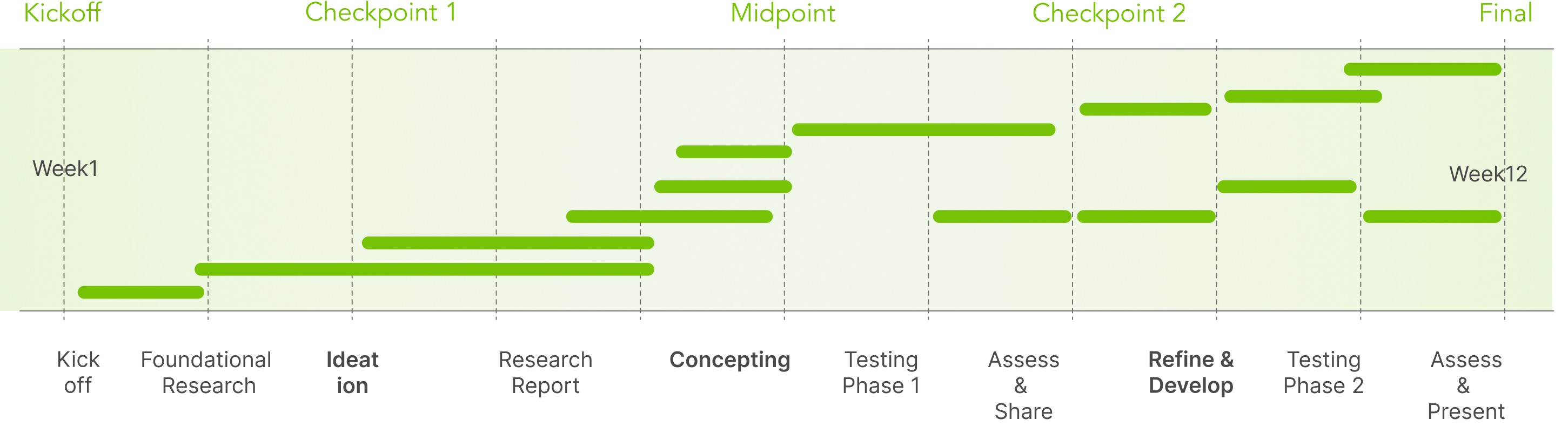
Our Timeline
We held five major meetings with senior executives during the project, including the Kick-off, Checkpoints 1, 2, and 3, and the Final presentation. I was responsible for the midpoint presentation.
Research
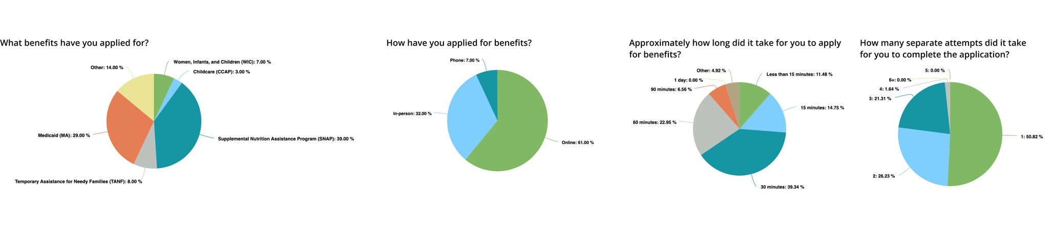
Comprehensive survey distributed to Georgia residents
During our research, we conducted a survey using an online survey service called Pollfish. We received 100 completed surveys, and 72 of those responses were from people who have applied for benefits in the state of Georgia.
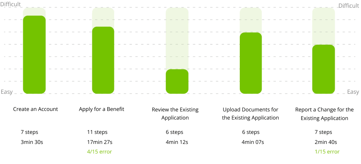
Original Website Flow Test
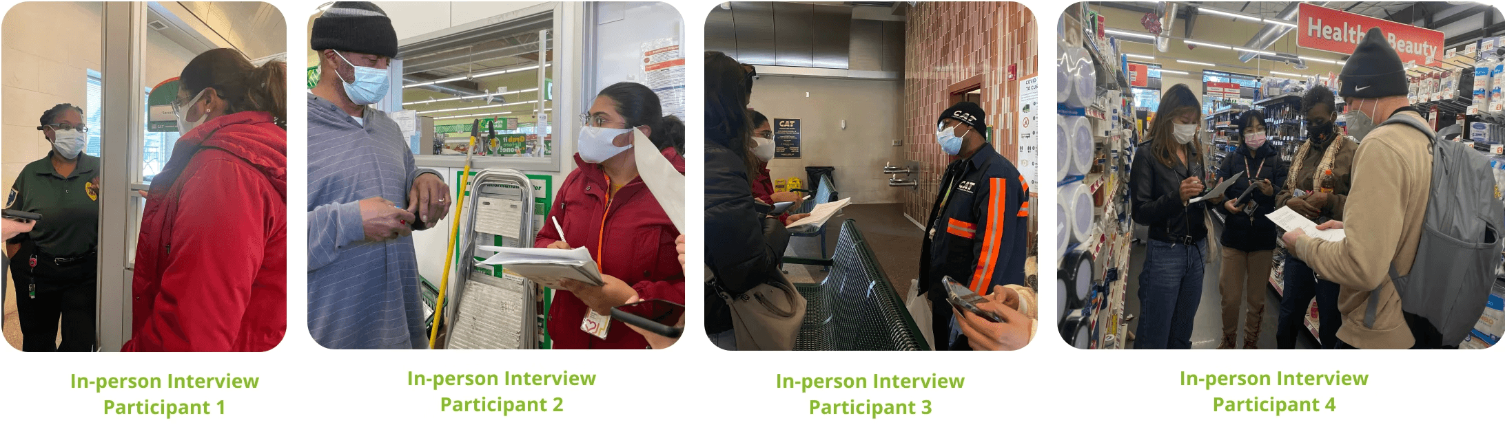
Real User Interview
Archetype
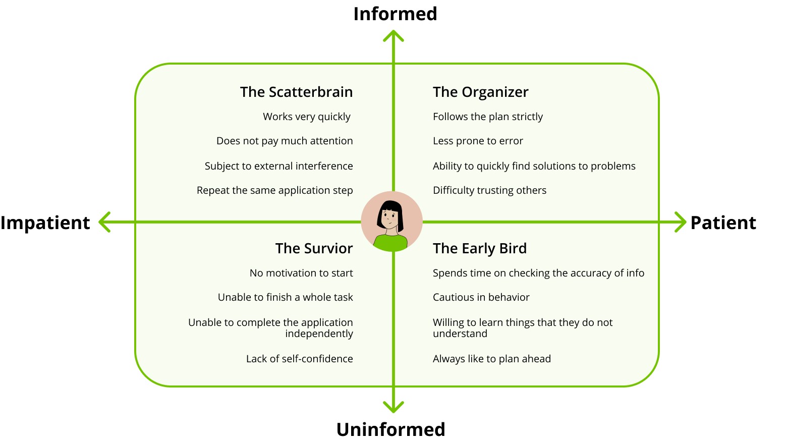
Instead of building detailed personas, we used archetypes to focus on behavioral patterns and goals shared across diverse visitor groups, avoiding assumptions tied to age, background, or appearance.These four characters, diverse in background and needs, took on the challenge of applying for benefits, allowing us to explore how different users interact with the portal.
Key User Insights
Simplified application process
Users need a faster, more intuitive way to complete their applications, with fewer steps and less complexity
Clearer step-by-step guidance
Users require clear instructions at every stage of the application, ensuring they understand policy.
Transparency benefit eligibility
Users want real-time updates and visibility into their eligibility and application status.
Ideation
Brainstorming
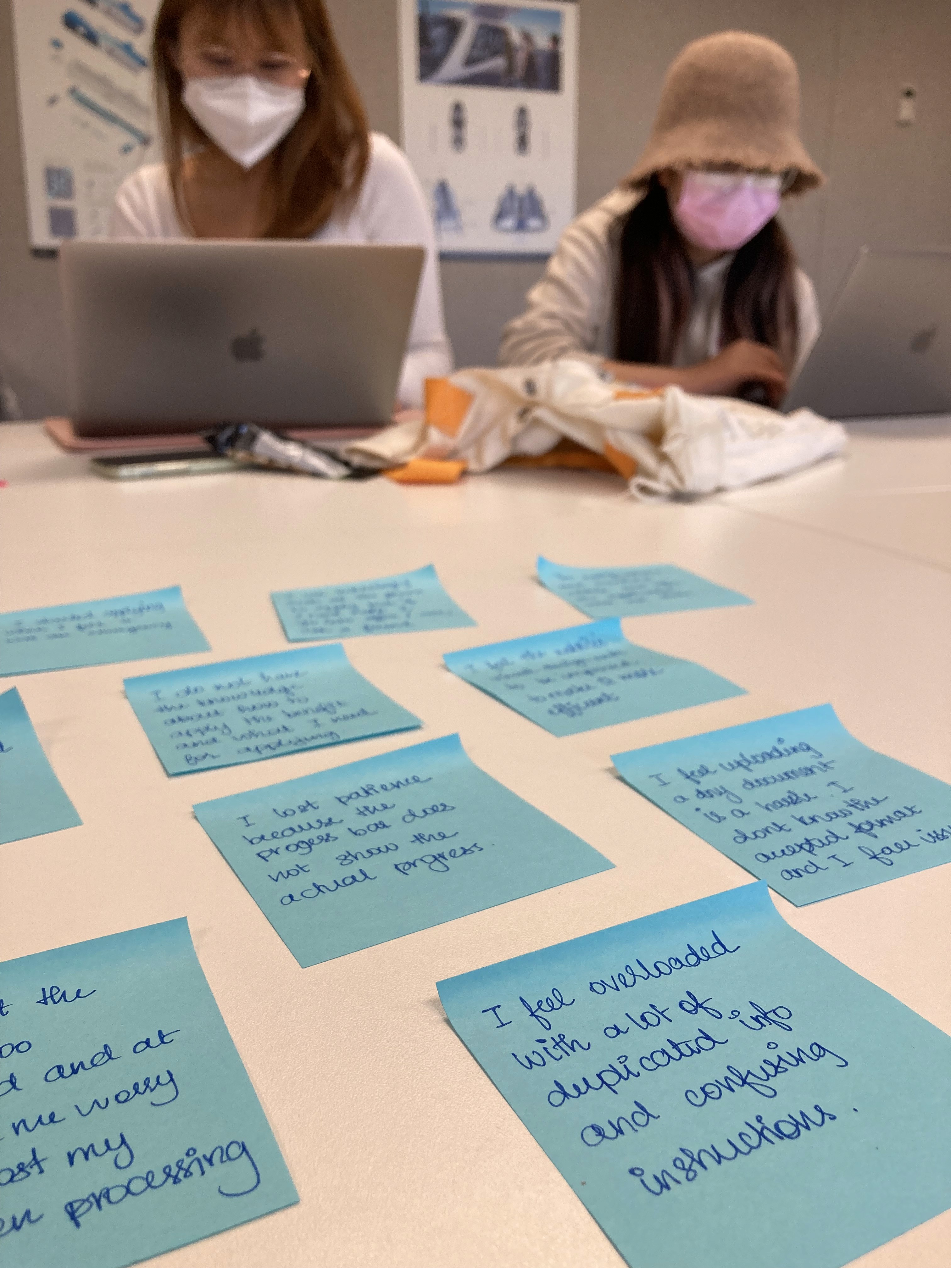
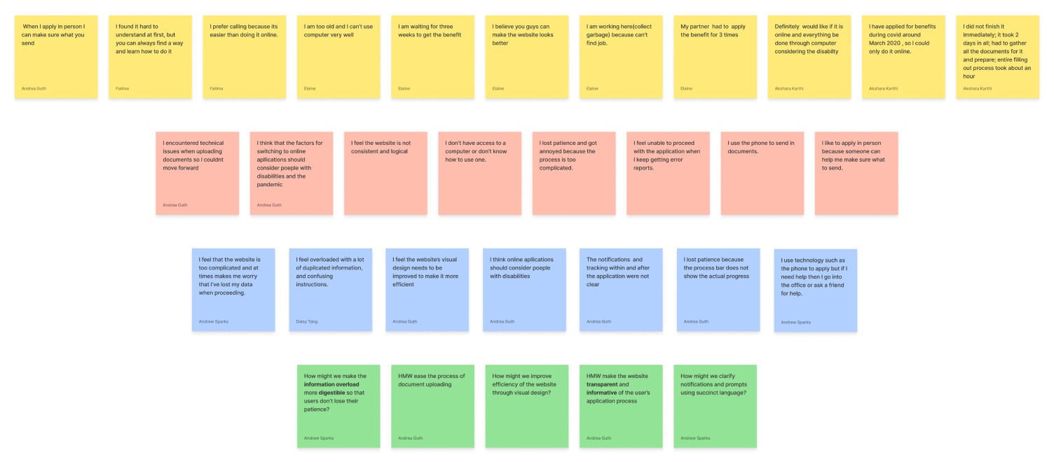
We start by writing down data in the form of “I“ statements in yellow stickies. These points are then grouped by similarity to form the orange ones. These insights are further combined to form the ideas in blue stickies. These blue stickies are further consolidated into green stickies as How Might We statements.
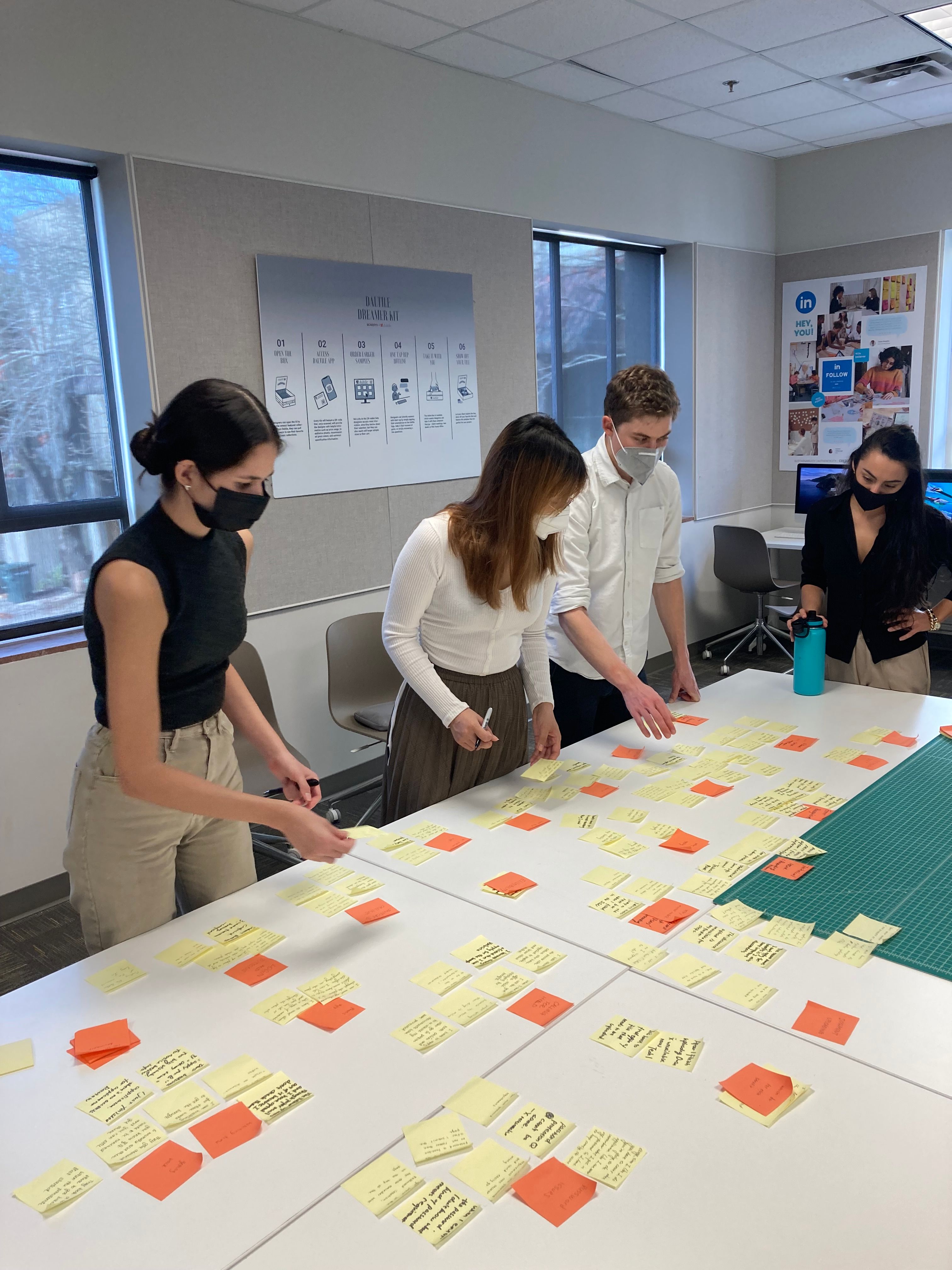
Affinitization
We voted for the design goals.
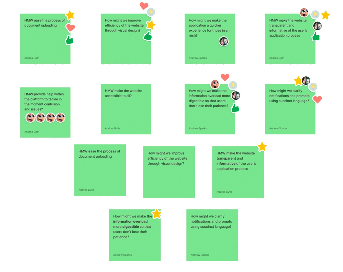

Design Goals
Reduce Overload
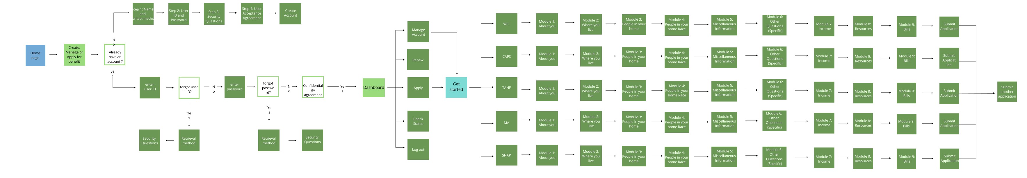
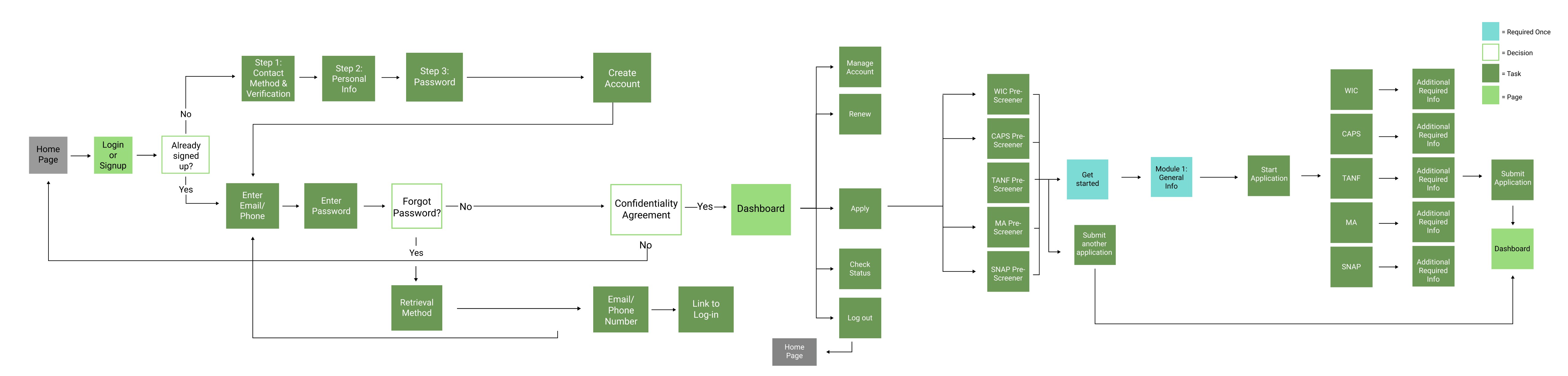
User Flow Redefine
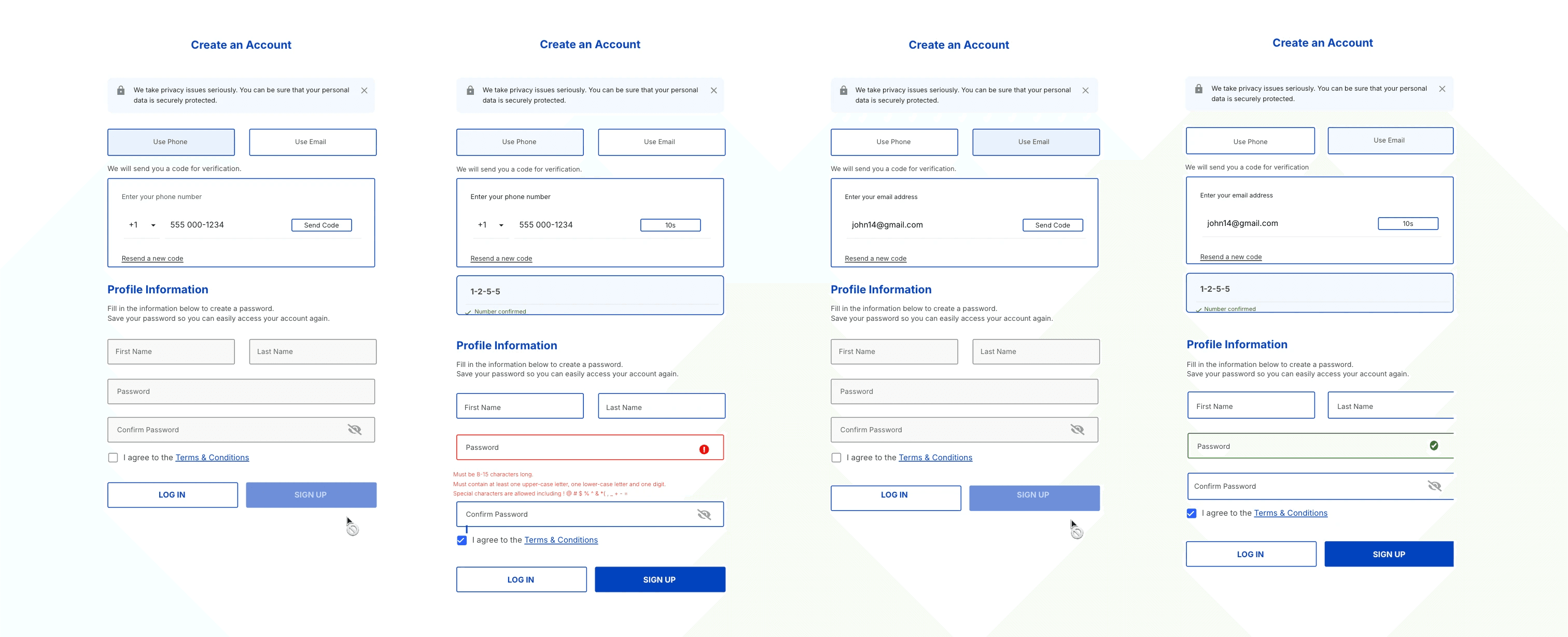
We have made significant renovations to the newly developed user flow sections. We have reduced the number of steps and simplified the process for creating an account and password retrieval systems.
Before
After
Ease Application Process
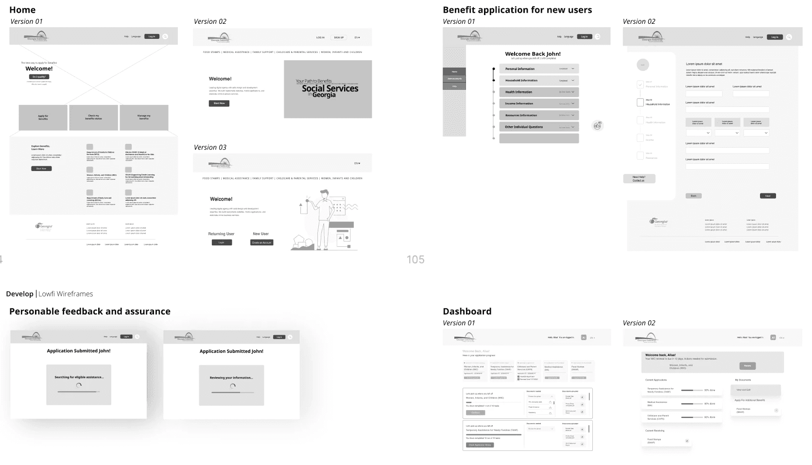
Low-fi Flow For Internal Testing
To kick off our project, we developed a low-fidelity prototype for internal testing, gathered feedback from all team members and stakeholders, and then made two iterations of the low-fidelity diagram.
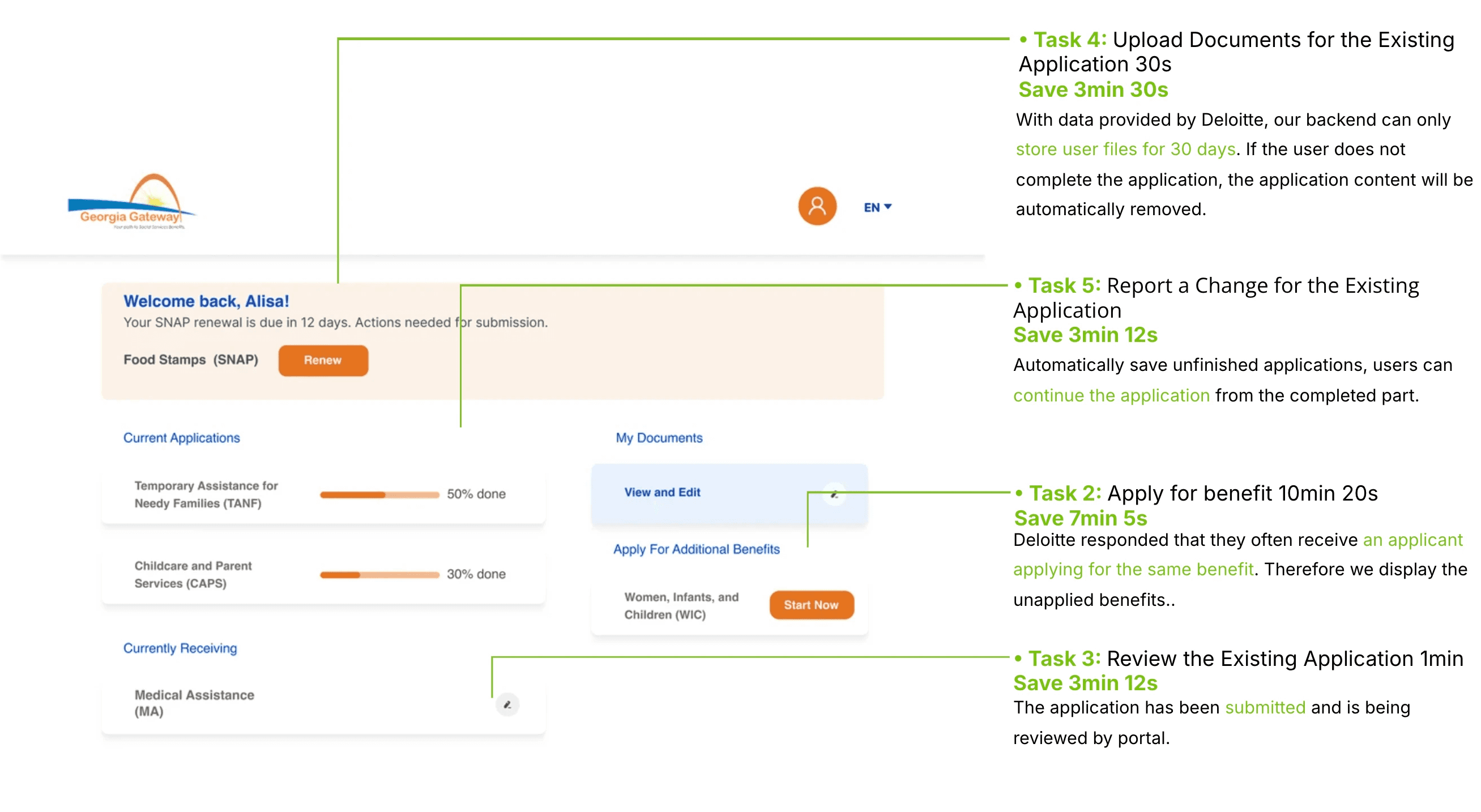
Mid-fi Flow for Real User Testing
We sent the mid-fi prototype to several interviewers for comprehensive testing and also conducted internal team testing to gather feedback. During this process, we meticulously calculated the time taken for each step of the application. As a result of our efforts, we were pleased to discover that our new process saved about 15 minutes compared to the old process.
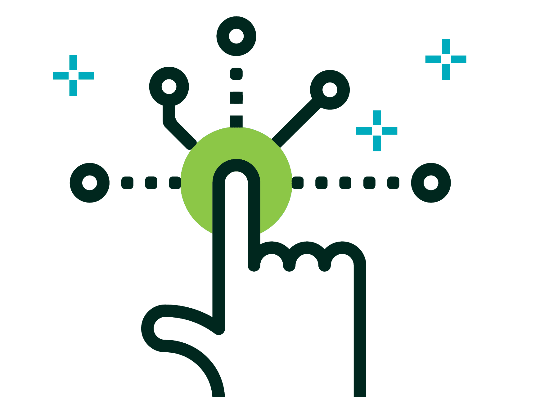
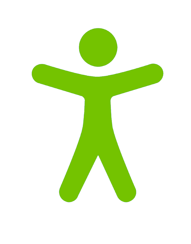
Improve Overall Accessibility
Comply with Federal Government Section 508 Design Guidelines
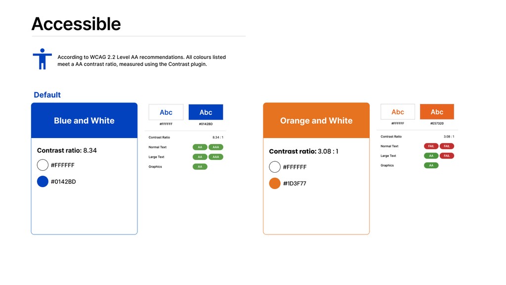
Before high-fidelity delivery, our team firmly believed that the new portal should be accessible to everyone. While complying with Section 508 guidelines is federally required, we recommend that the final design focus more on assisting users instead of just meeting standards.
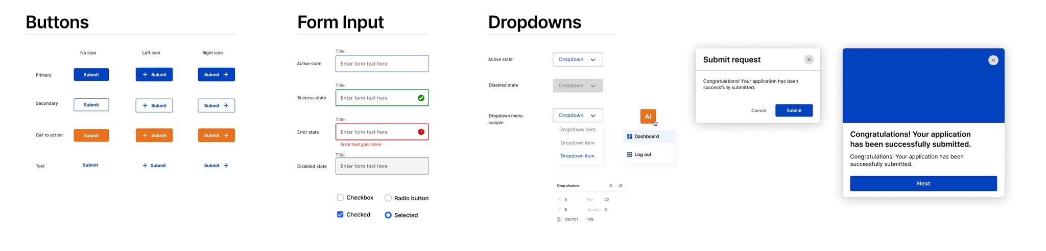
Design Iteration Based on New UI Kit
“Good accessibility is about compliance, great accessibility is about empathy.”
Card Design Guideline
The minimum Contrast Ratio of a button needs to be at least 3:1. The previous orange only has a 1.88:1 against white, which doesn’t meet the minimum requirement.
Card Design Guideline
Encourage Digital Adoption
Comprehensive replacement of paper applications
Our goal is for the website to serve as a comprehensive alternative to the paper application, providing a more efficient and environmentally friendly process. To achieve this, we ensure that Deloitte has a robust cloud-based system to securely store user information.

User Guideline and Instructions
Our goal is for the website to serve as a comprehensive alternative to the paper application, providing a more efficient and environmentally friendly process. To achieve this, we ensure that Deloitte has a robust cloud-based system to securely store user information.

Final Overlook
Back to Home
Next Project
Wanna work with me?