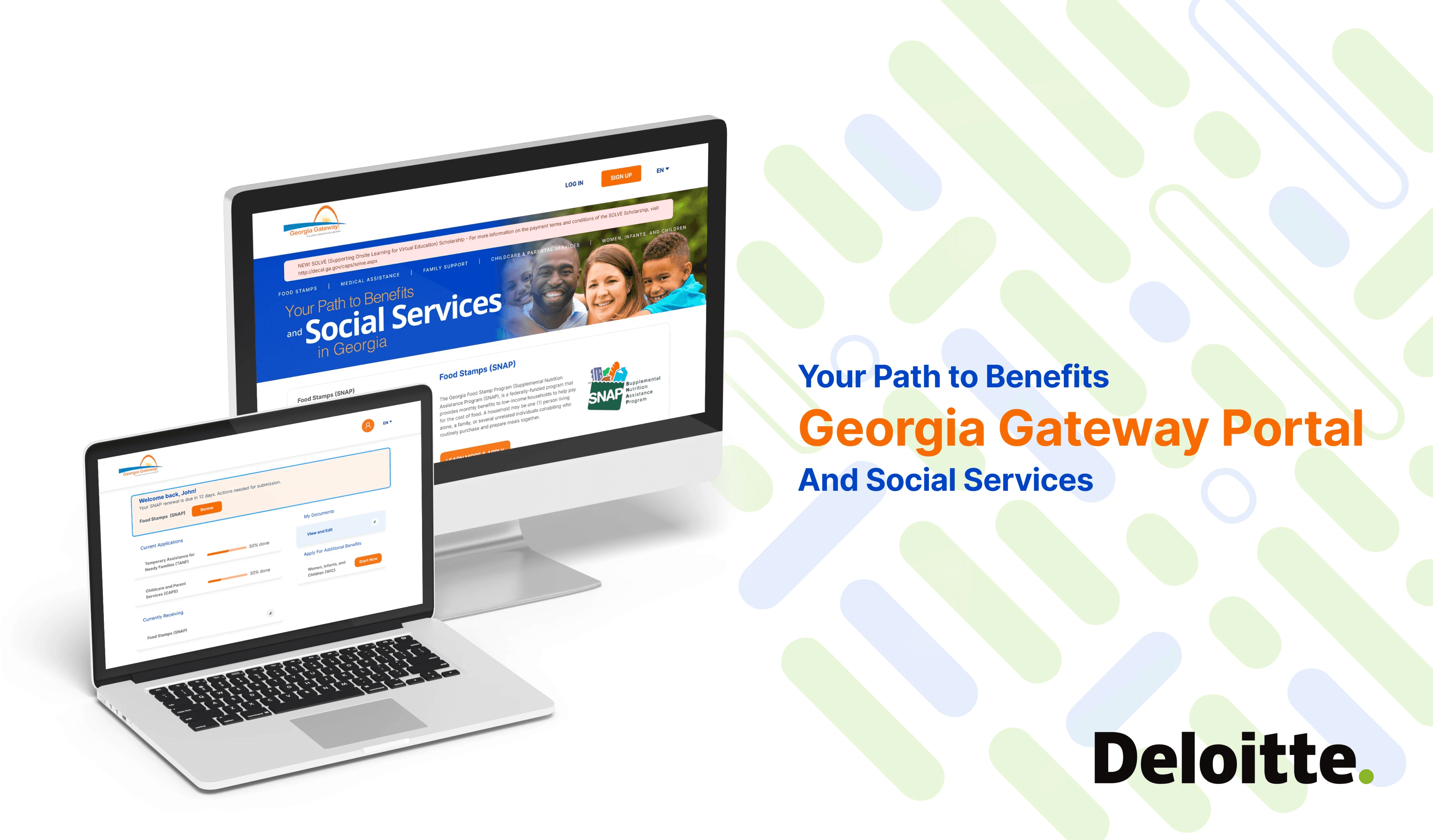
"Deloitte is leading the development of a streamlined benefits application website for Georgia residents. The project focuses on redesigning an efficient, user-friendly platform to simplify the application, management, and renewal of various benefits.“
Role
UI Designer
UX Researcher
Platform
Responsive Web
Timeframe
3 months
Team
20 member
design group
OVERVIEW
Background
Team Member: Cross-team Collaboration
In early 2022, Deloitte decided to assist the Georgia government in iterating on its benefits application website to enhance the platform's efficiency and user experience. Our 10-member design team includes a UX researcher, a UX designer, and a UI designer. I work closely with my mentor who is the project manager to develop the full track design content.
The Project Process: Our Timeline
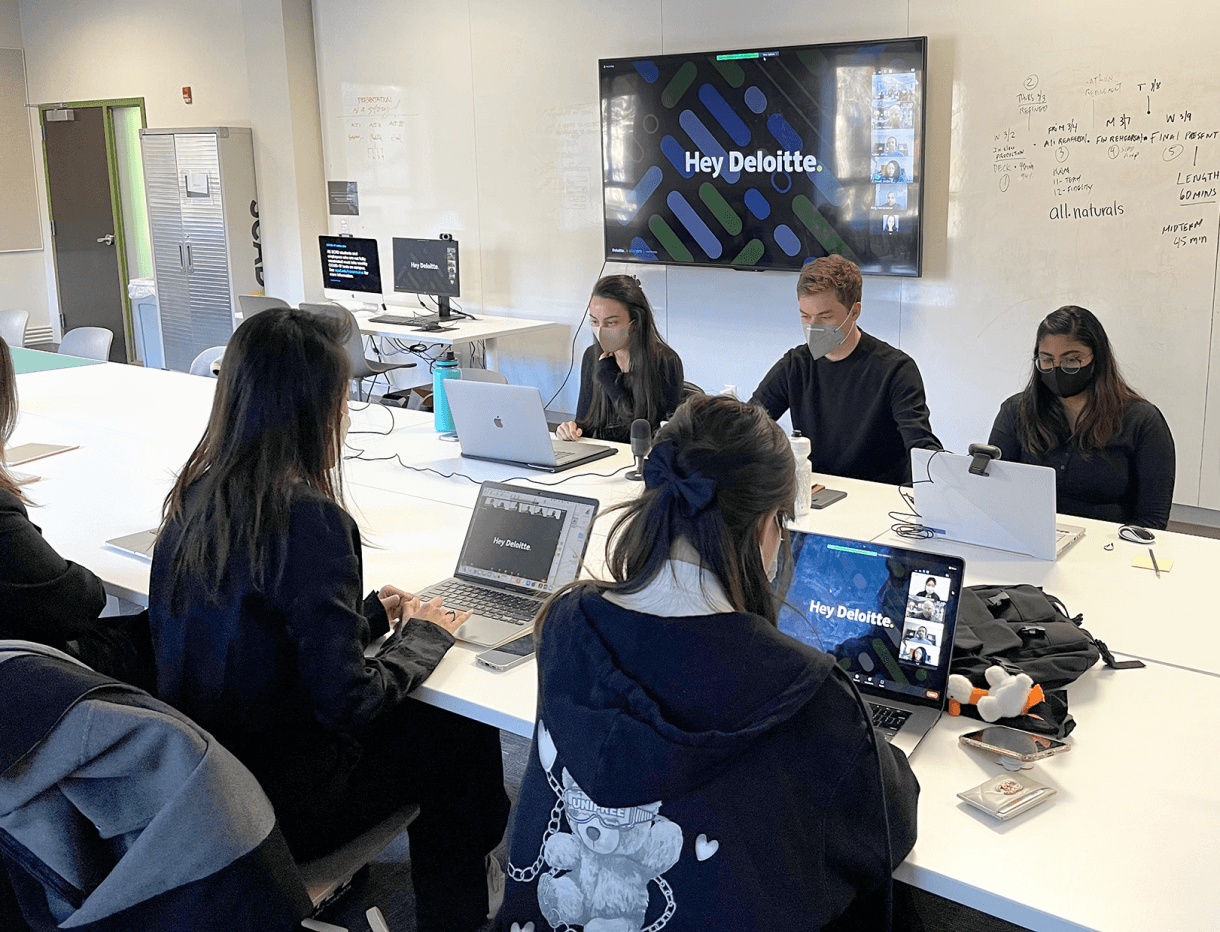
We held five major meetings with senior executives during the project, including the Kick-off, Checkpoints 1, 2, and 3, and the Final presentation. I was responsible for the midpoint presentation.

How Might We

How might we improve the website’s efficiency through better visual design?
How might we ease the documentation process?
How might we clarify the application’s timeline?
Design Overview
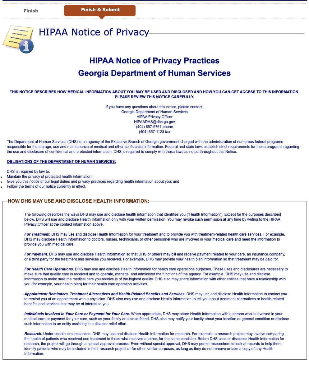
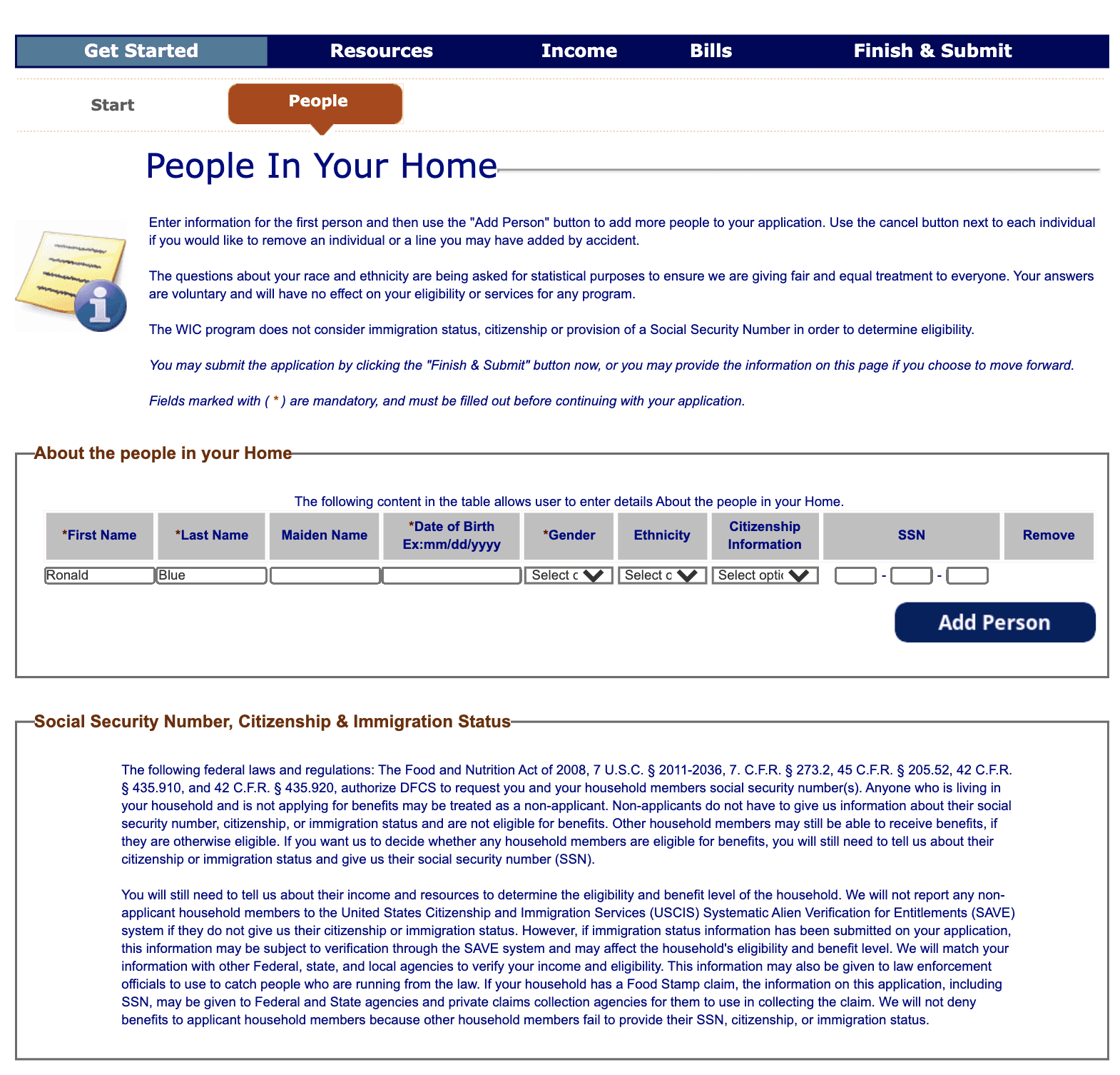
During the project, I took charge of the UI design phase. I collaborated with team members and participated in the UX research process to ensure our designs met user needs and project goals. Ultimately, we delivered a new application website that improved application speed and efficiency.
Before
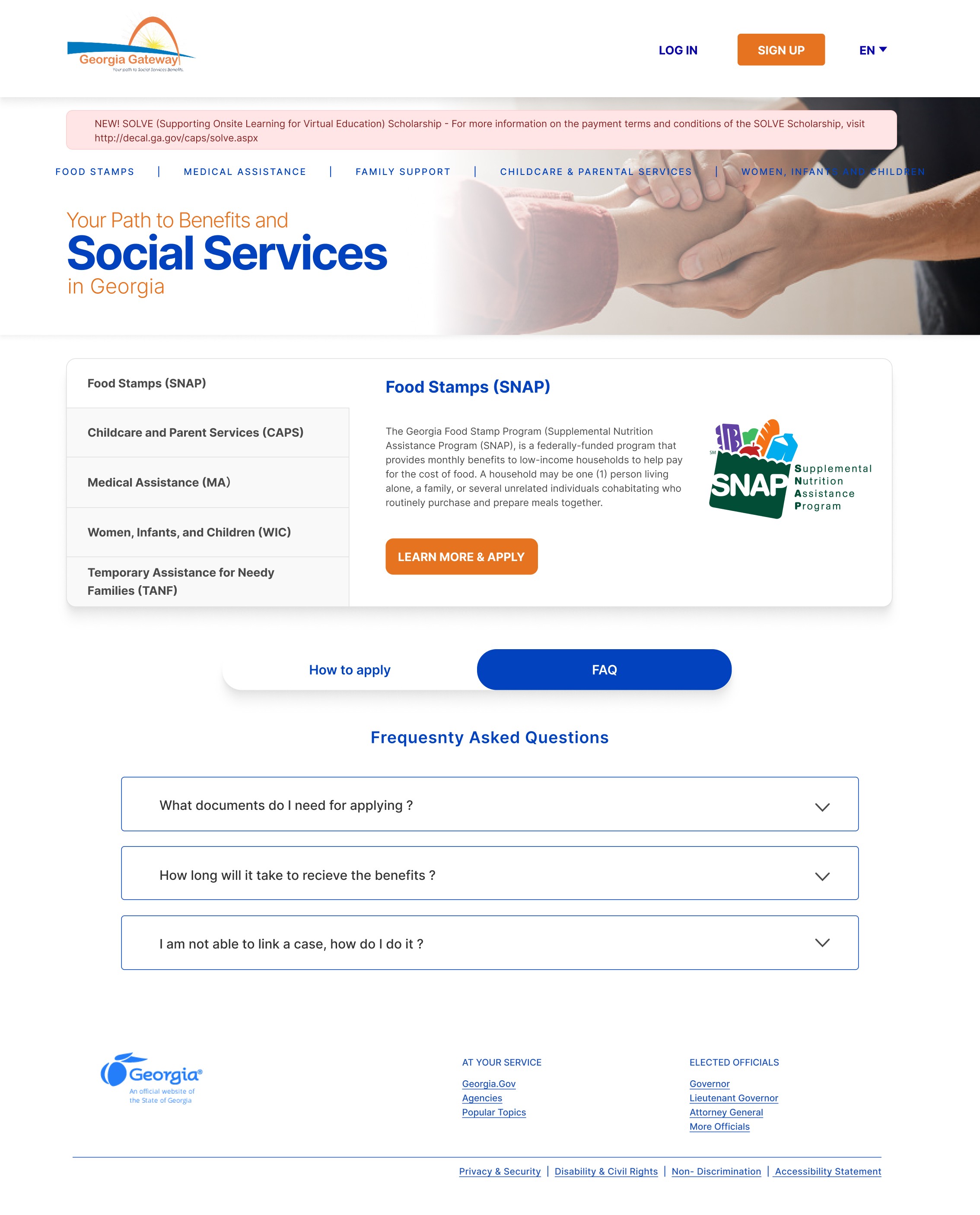
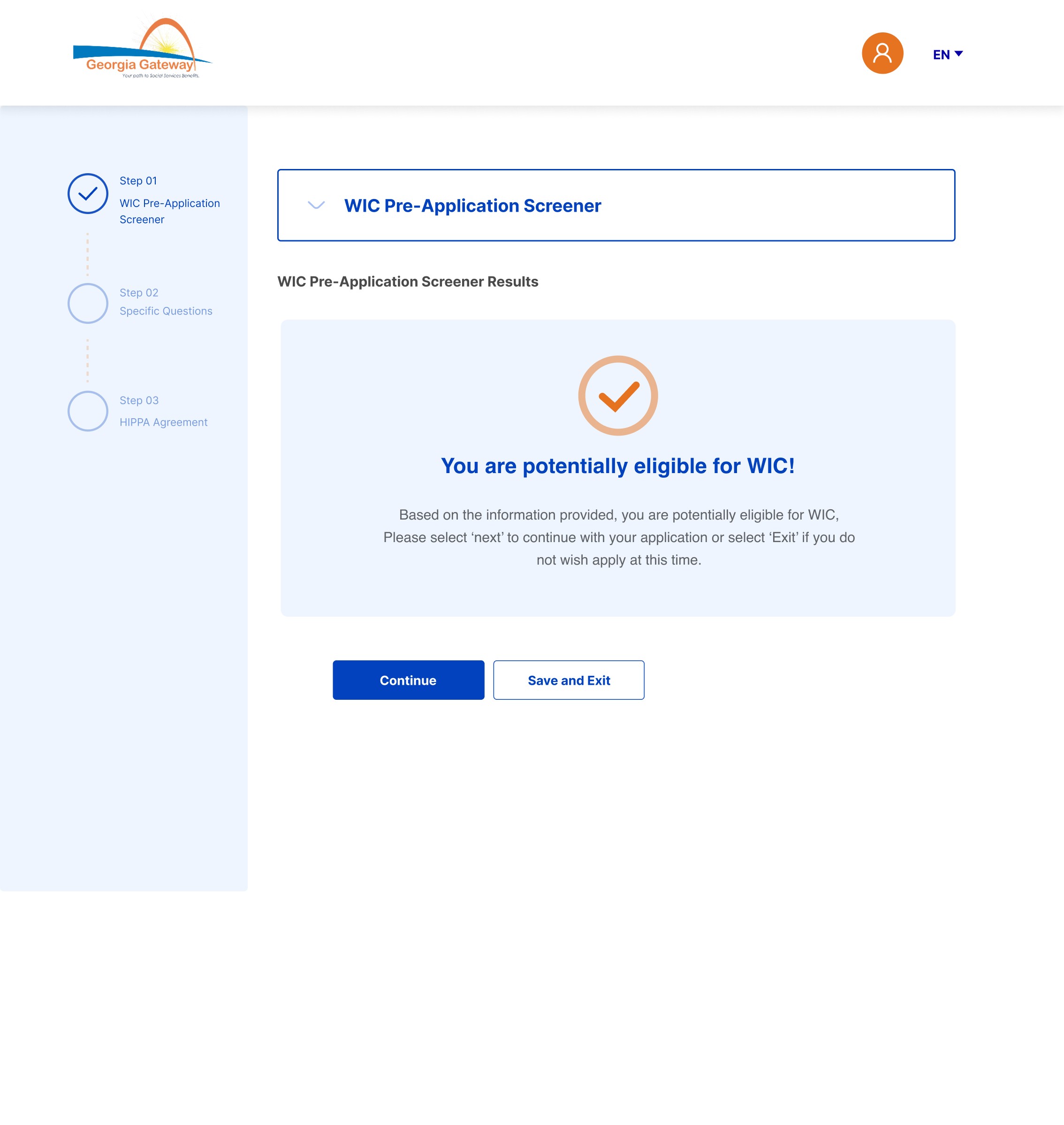
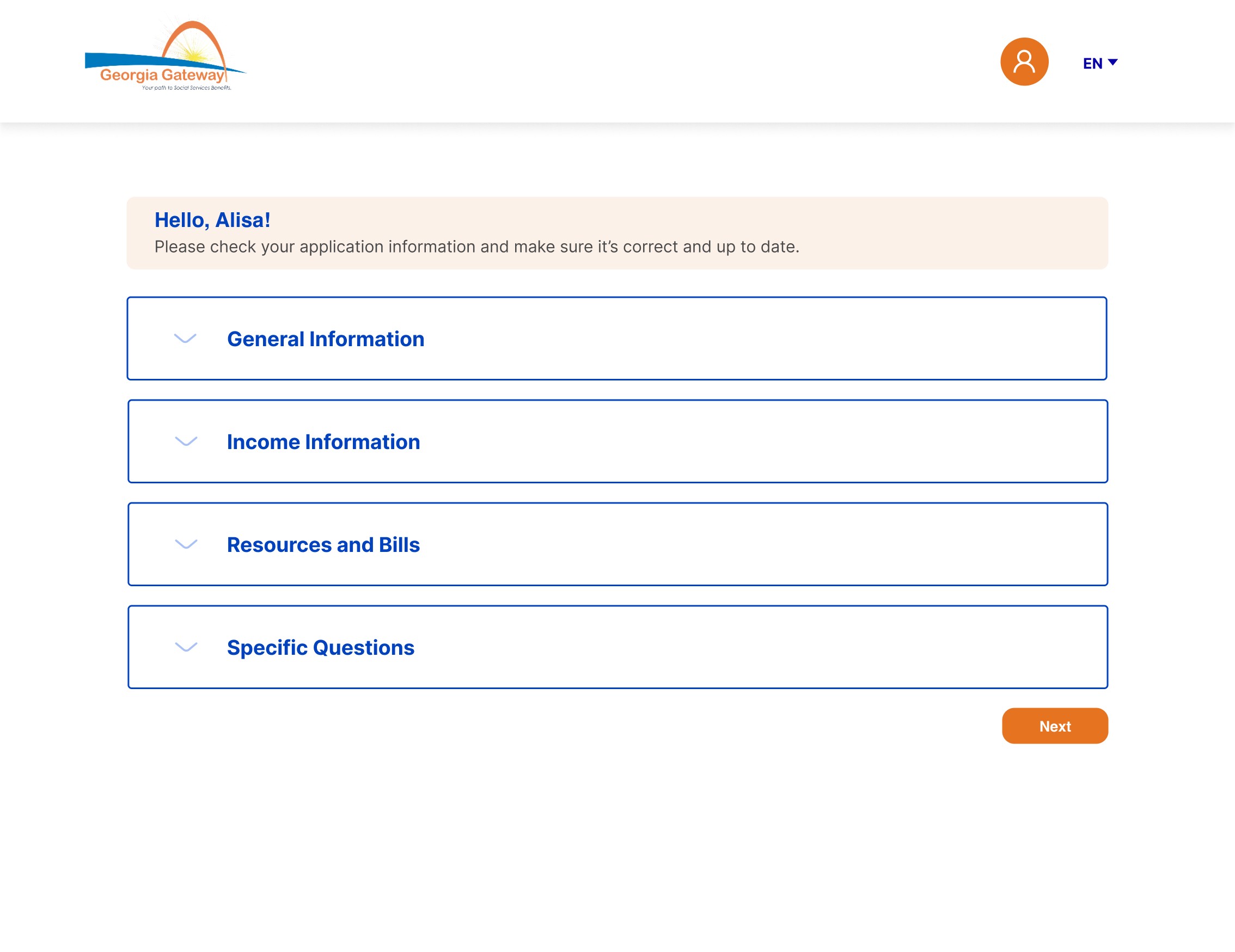
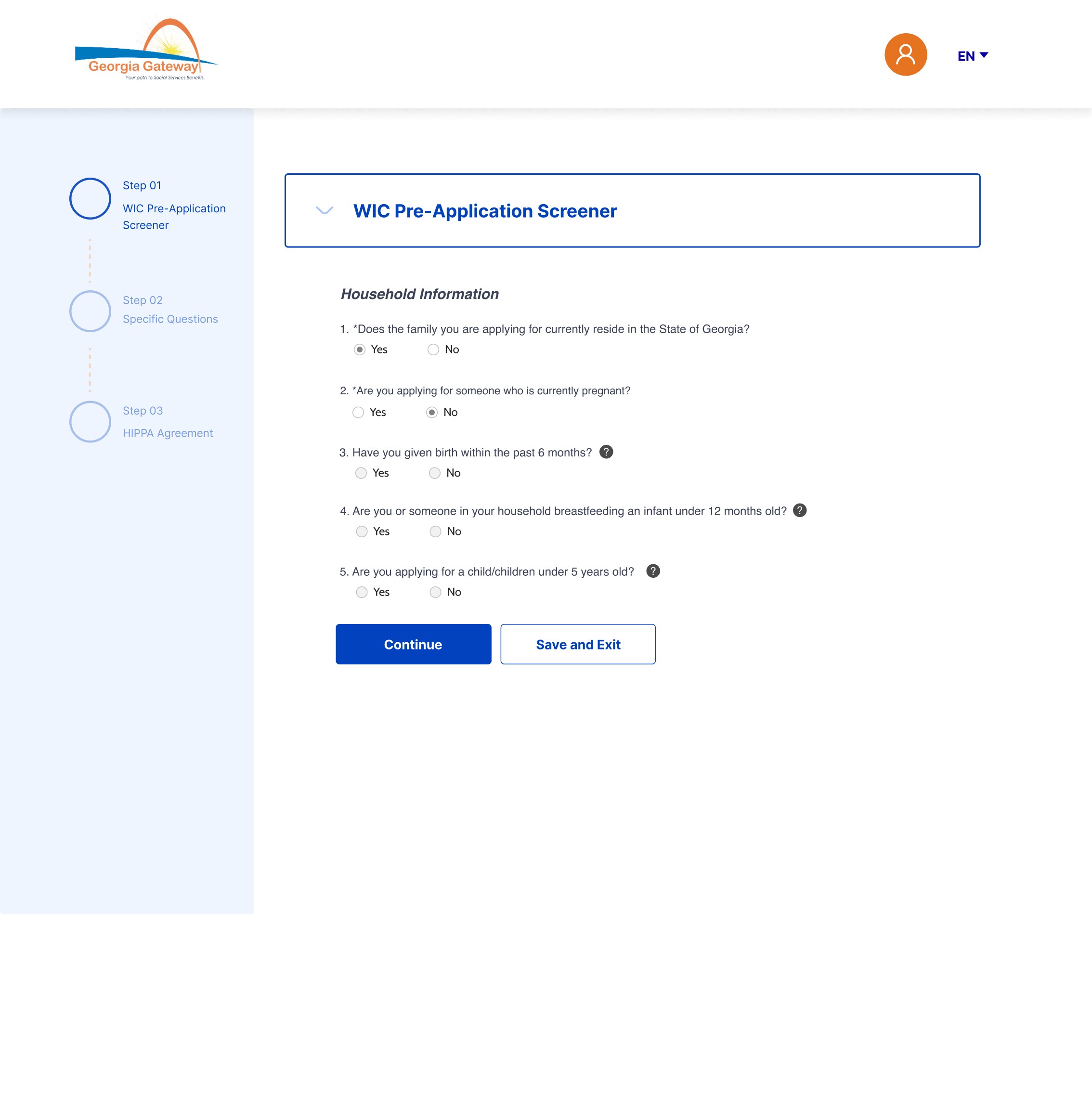
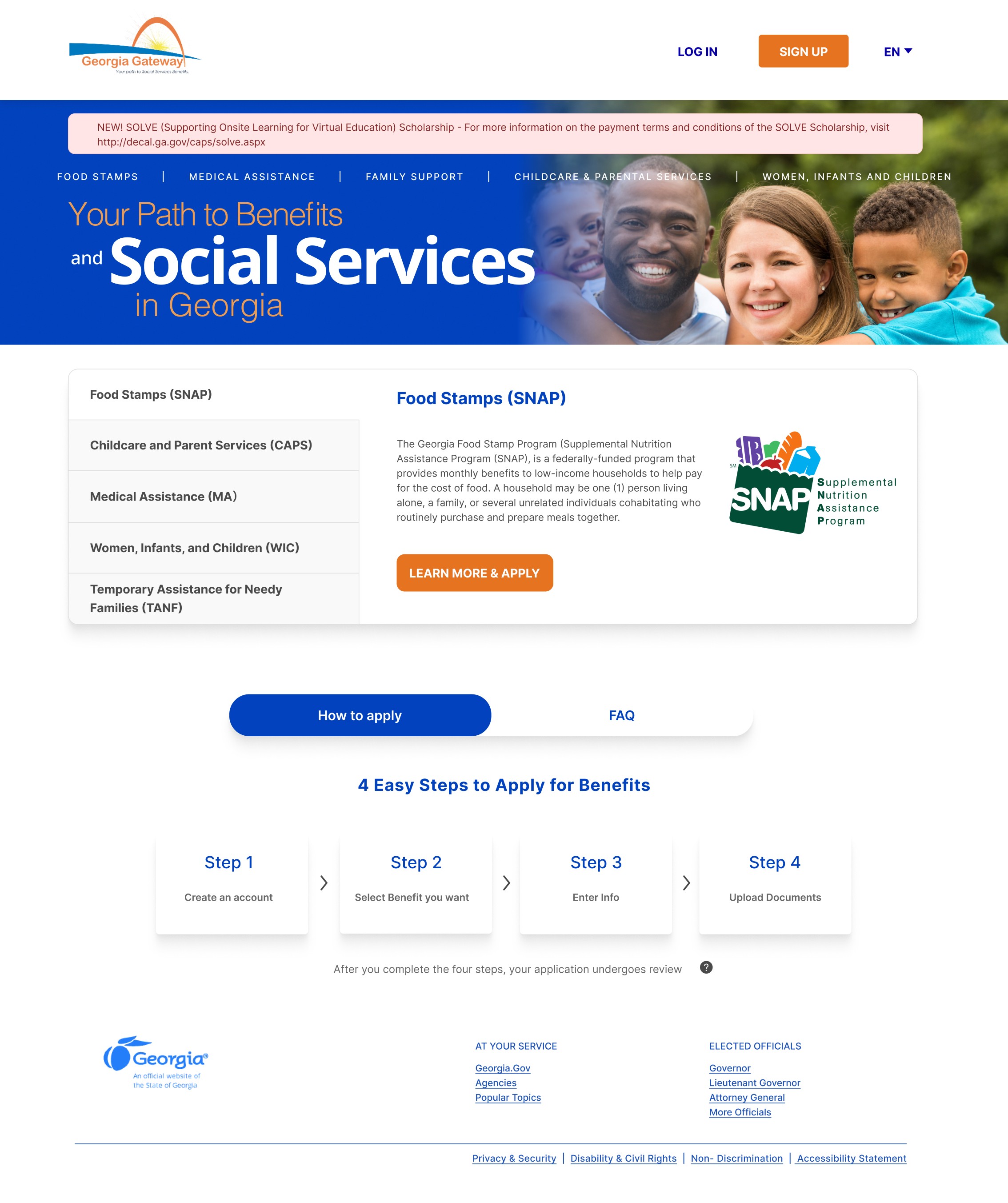
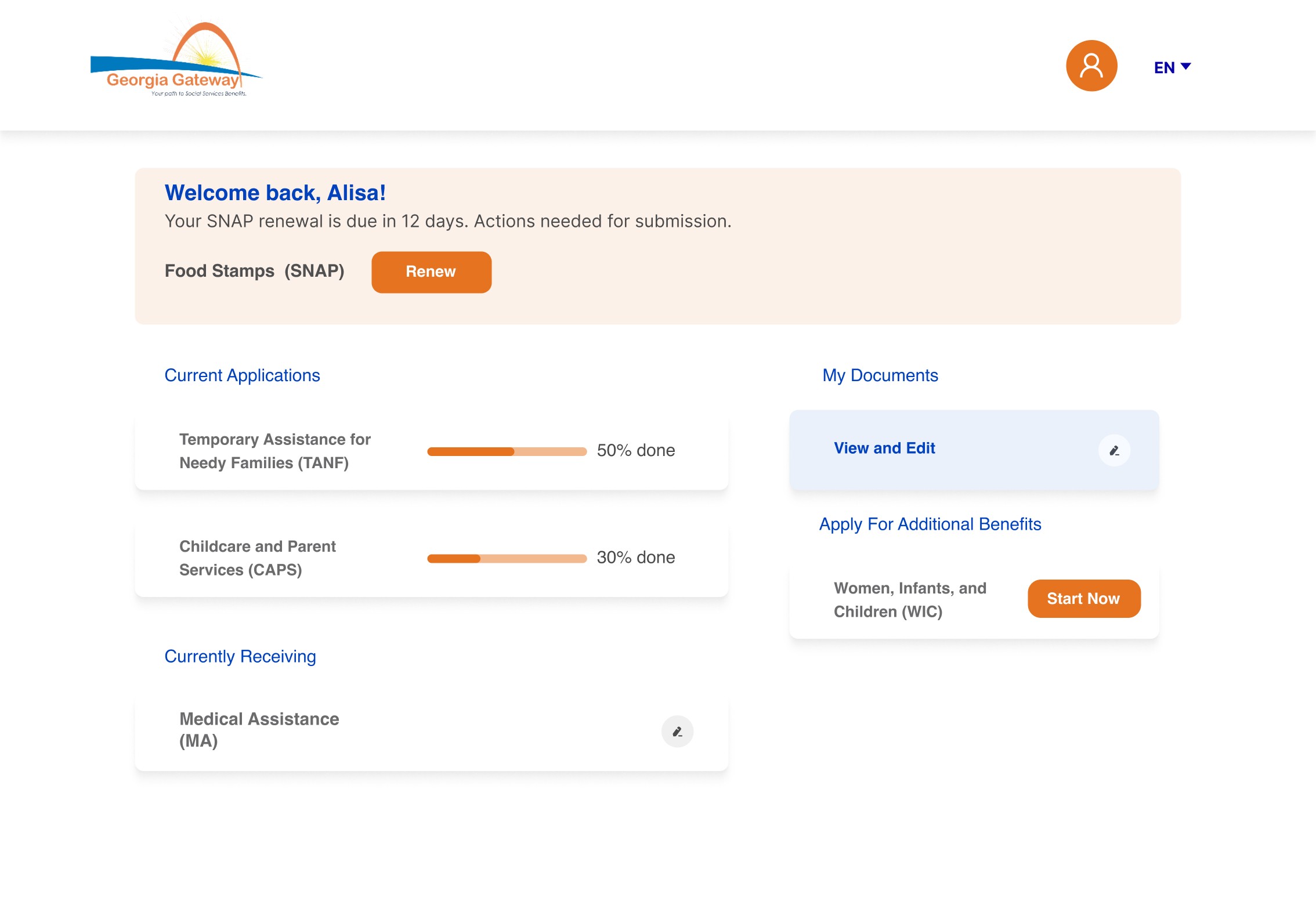
After
UXD Research
Real Data From User
Comprehensive survey distributed to Georgia residents
During our research, we conducted a survey using an online survey service called Pollfish. We received 100 completed surveys, and 72 of those responses were from people who have applied for benefits in the state of Georgia.

Survey Result by Pollfish
User Flow Test
Our team follows a structured approach by breaking down each task into detailed steps and assigning an estimated average time for completion. Throughout the process, we carefully observe user interactions, gather insights, and document any challenges or issues encountered. This method allows us to track user experiences in detail and adjust based on real-time observations.
• Task 1: Create an account
• Task 2: Apply for a benefit
• Task 3: Review the existing application
• Task 4: Upload documents for the existing application
• Task 5: Report a change to the existing application
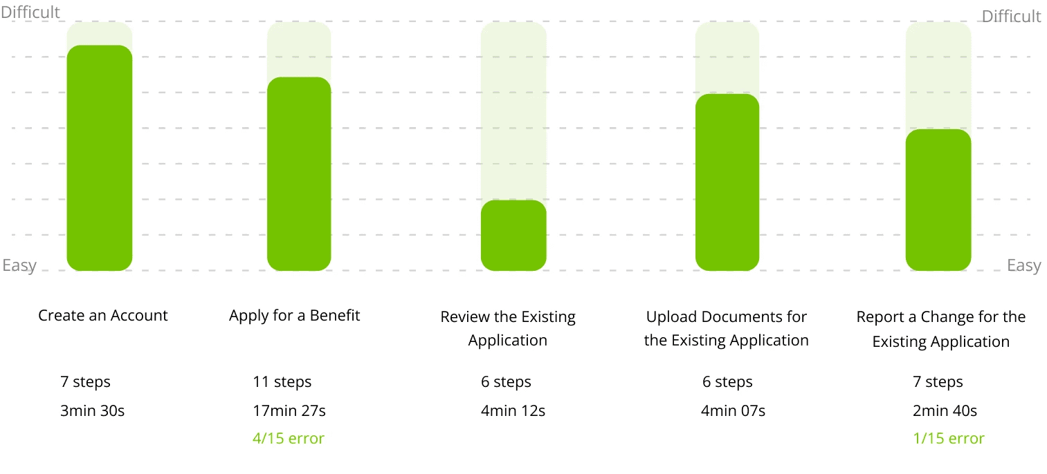
Time of Test Result
Real Data From User
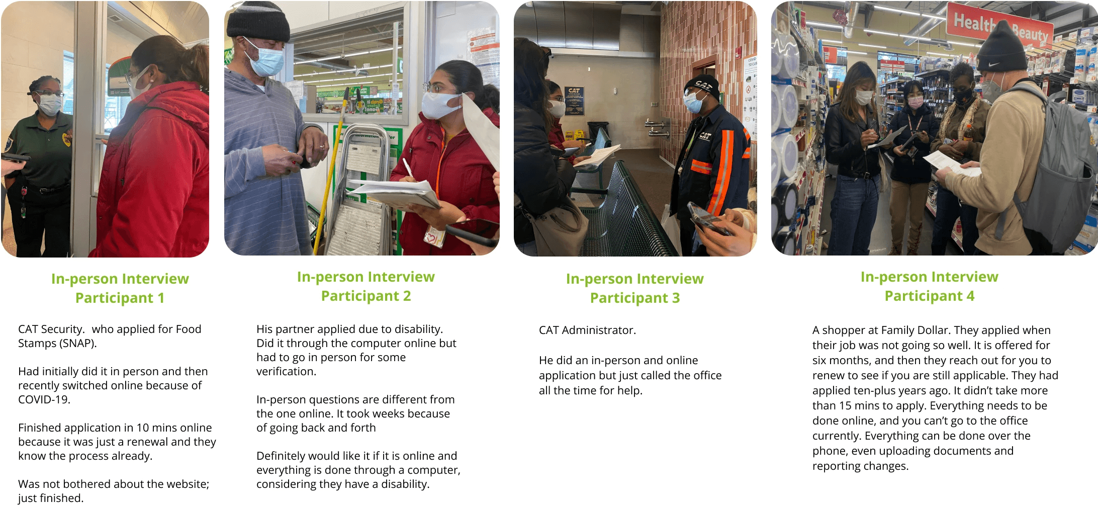
Real User Interview
Our team went out into the city of Savannah and interviewed people in the interest of learning more about the user’s behavior to improve the overall user experience of applying for benefits using the Georgia Gateway Portal.
Throughout the interview, there were no mentions of research being used for Deloitte and its products.
“
Archetype & Personas
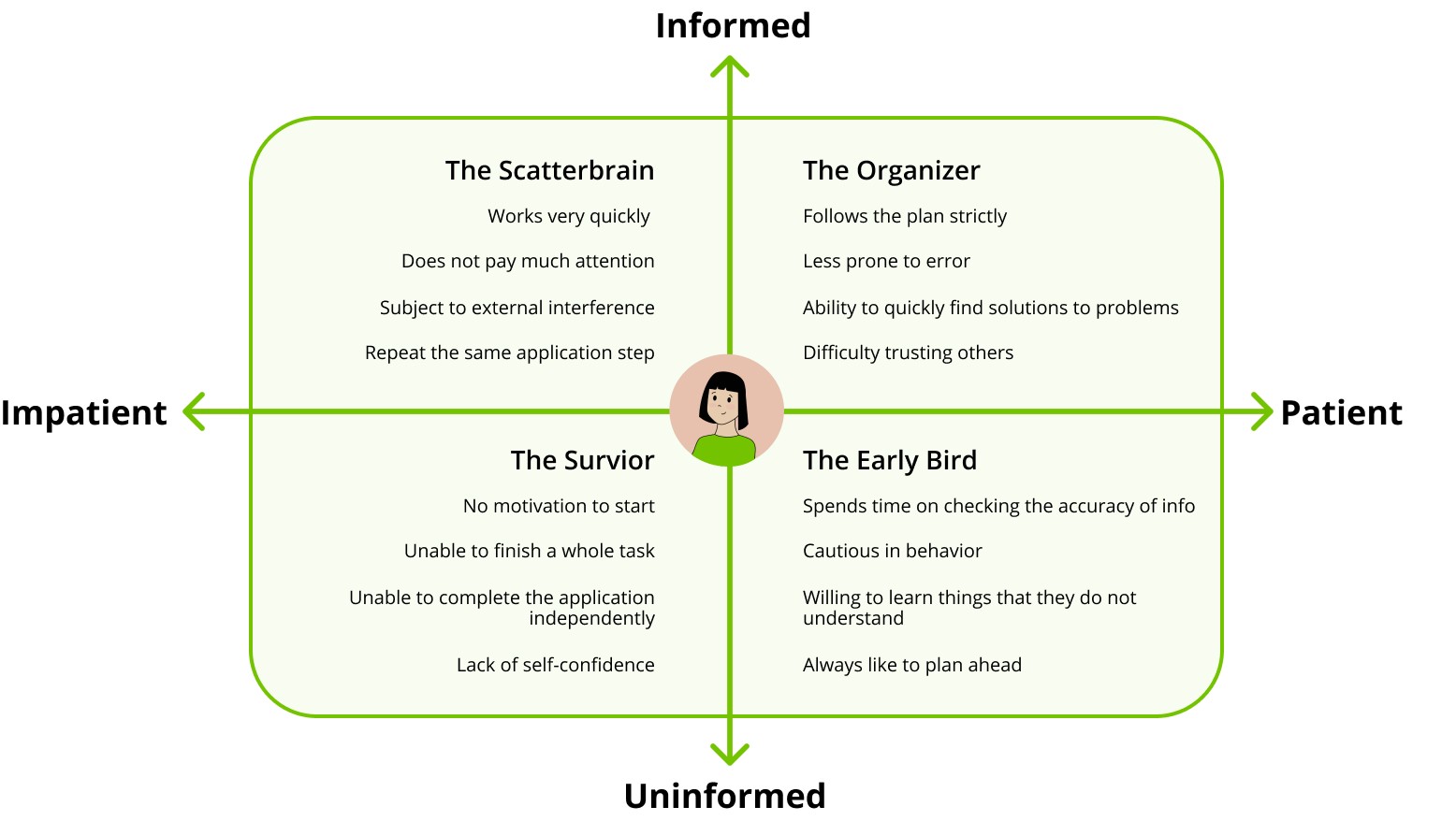
To bring the State Portal's user experience to life, we created a cast of fictional personas, each with their own unique traits, who navigated a series of tasks on the old platform. These four characters, diverse in background and needs, took on the challenge of applying for benefits, allowing us to explore how different users interact with the portal.
Key User Insights
Through a structured survey and user interviews with Georgia residents who had previously applied for state benefits, we uncovered several significant pain points.
Simplified application process
Users need a faster, more intuitive way to complete their applications, with fewer steps and less complexity, reducing the time spent on the process.
Clearer step-by-step guidance
Users require clear instructions at every stage of the application, ensuring they understand what information is needed and what to expect next.
Transparency benefit eligibility
Users want real-time updates and visibility into their eligibility and application status, providing clarity on where they stand in the process.
Brainstorming Sessions
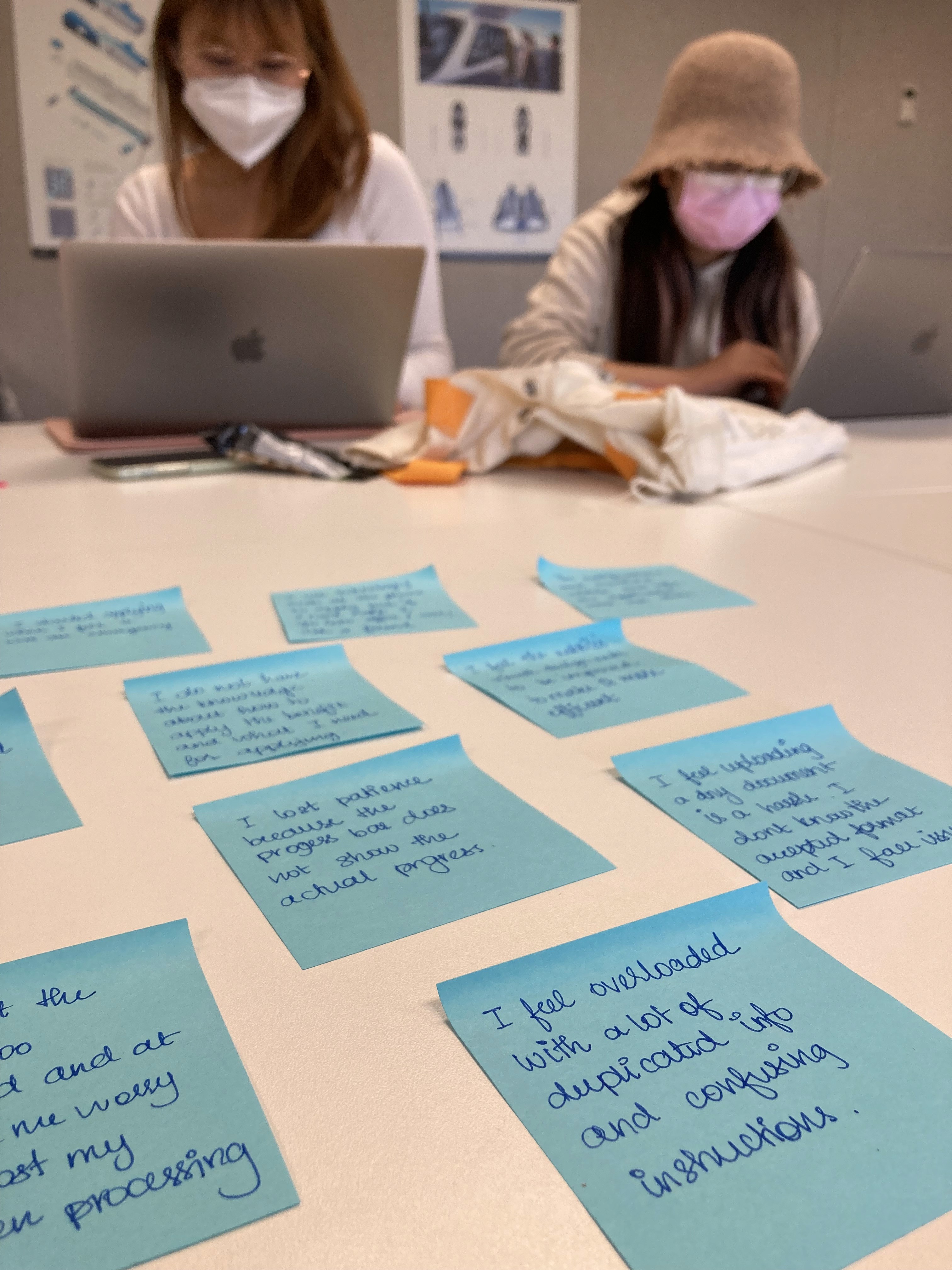
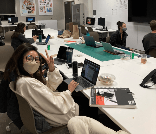
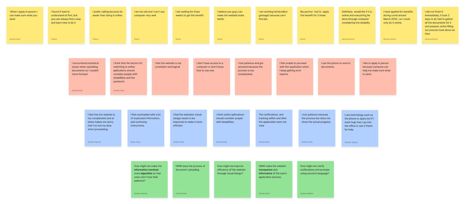
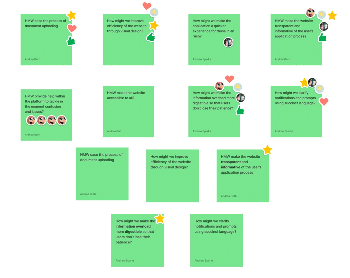
We start by writing down data in the form of “I“ statements in yellow stickies. These points are then grouped by similarity to form the orange ones. These insights are further combined to form the ideas in blue stickies. These blue stickies are further consolidated into green stickies as How Might We statements.
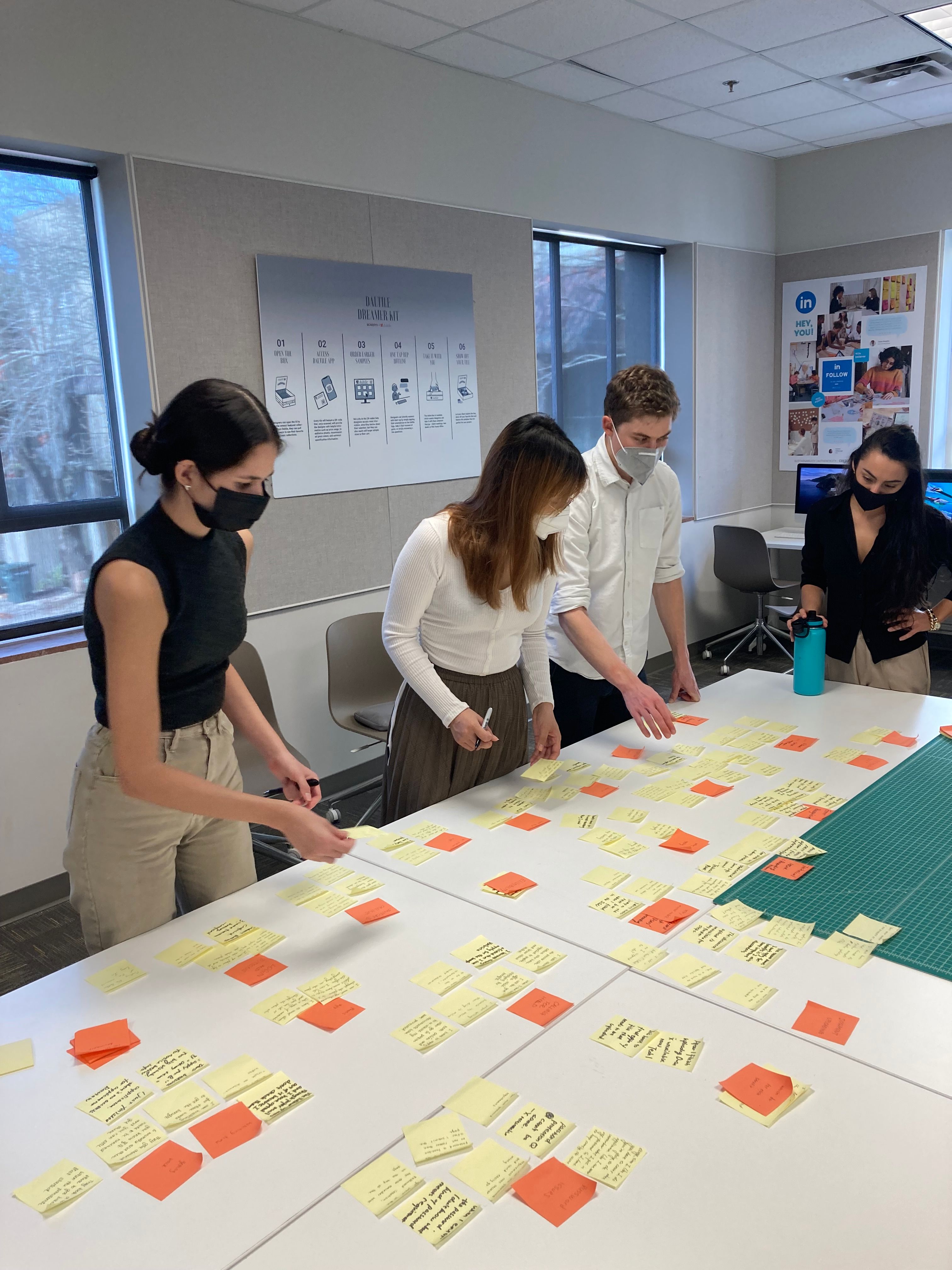
Affinitization
Affinitization
Group Vote
Our Goals
Ease Application Process

Reduce Information Overload
Improve Overall Accessibility
Encourage Digital Adoption
Phase1
Reduce Information Overload
Phase2
Ease Application Process
Low-fi Flow For Internal Testing
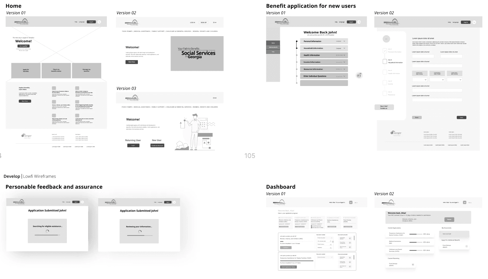
To kick off our project, we developed a low-fidelity prototype for internal testing, gathered feedback from all team members and stakeholders, and then made two iterations of the low-fidelity diagram.
Mid-fi Flow for Real User Testing
We sent the mid-fi prototype to several interviewers for comprehensive testing and also conducted internal team testing to gather feedback. During this process, we meticulously calculated the time taken for each step of the application. As a result of our efforts, we were pleased to discover that our new process saved about 15 minutes compared to the old process.
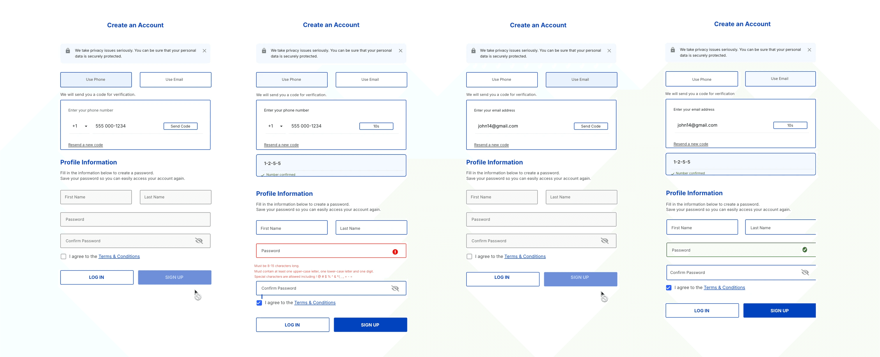
Test 1
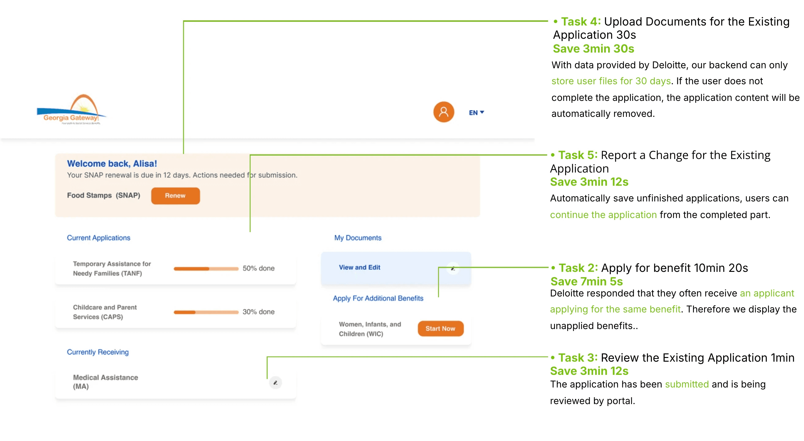
Phase3
Improve Overall Accessibility
Comply with Federal Government Section 508 Design Guidelines
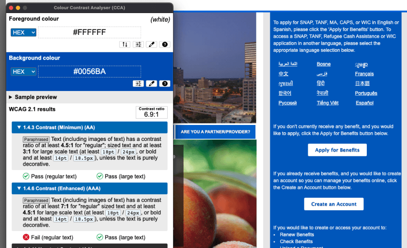
Before high-fi delivery, our team felt strongly that the new portal should be accessible to all. While it is federally mandated to comply with Section 508 guidelines, we suggest that the final design be more about helping others rather than mere compliance. Through our research, we discovered some problems with the current site and came up with suggestions to help make the website more accessible and inclusive.
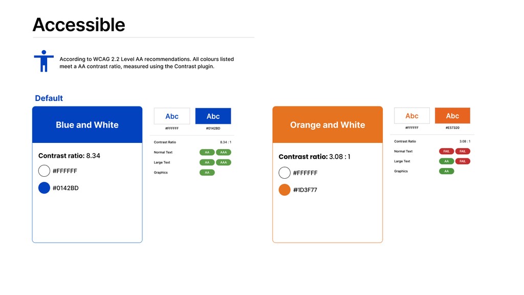

按钮的最小对比度需要至少为 3:1。以前的橙色只针对白色的对比度为 1.88:1,这不符合最低要求。
Accessible Design
Design Iteration Based on New UI Kit
“良好的无障碍环境是关于合规,而伟大的无障碍环境是关于同理心。”
Sheri Byrne-Haber(对无障碍环境的关注)
Card Design Guideline
The minimum Contrast Ratio of a button needs to be at least 3:1. The previous orange only has a 1.88:1 against white, which doesn’t meet the minimum requirement.
Card Design Guideline
This orange meets the standards for WCAG Level AA Large Text if the button text is at least 14px and bold.
Phase4
Encourage Digital Adoption
Comprehensive replacement of paper applications
Our goal is for the website to serve as a comprehensive alternative to the paper application, providing a more efficient and environmentally friendly process. To achieve this, we ensure that Deloitte has a robust cloud-based system to securely store user information.

Clear Application Steps
高保真应用程序流程
展示和定义
We implemented a user-friendly application sequence with a clear step navigation bar to guide users through the process. Detailed instructions were strategically placed near text boxes that had previously caused confusion. This approach significantly reduced the need for manual assistance with offline paper applications.
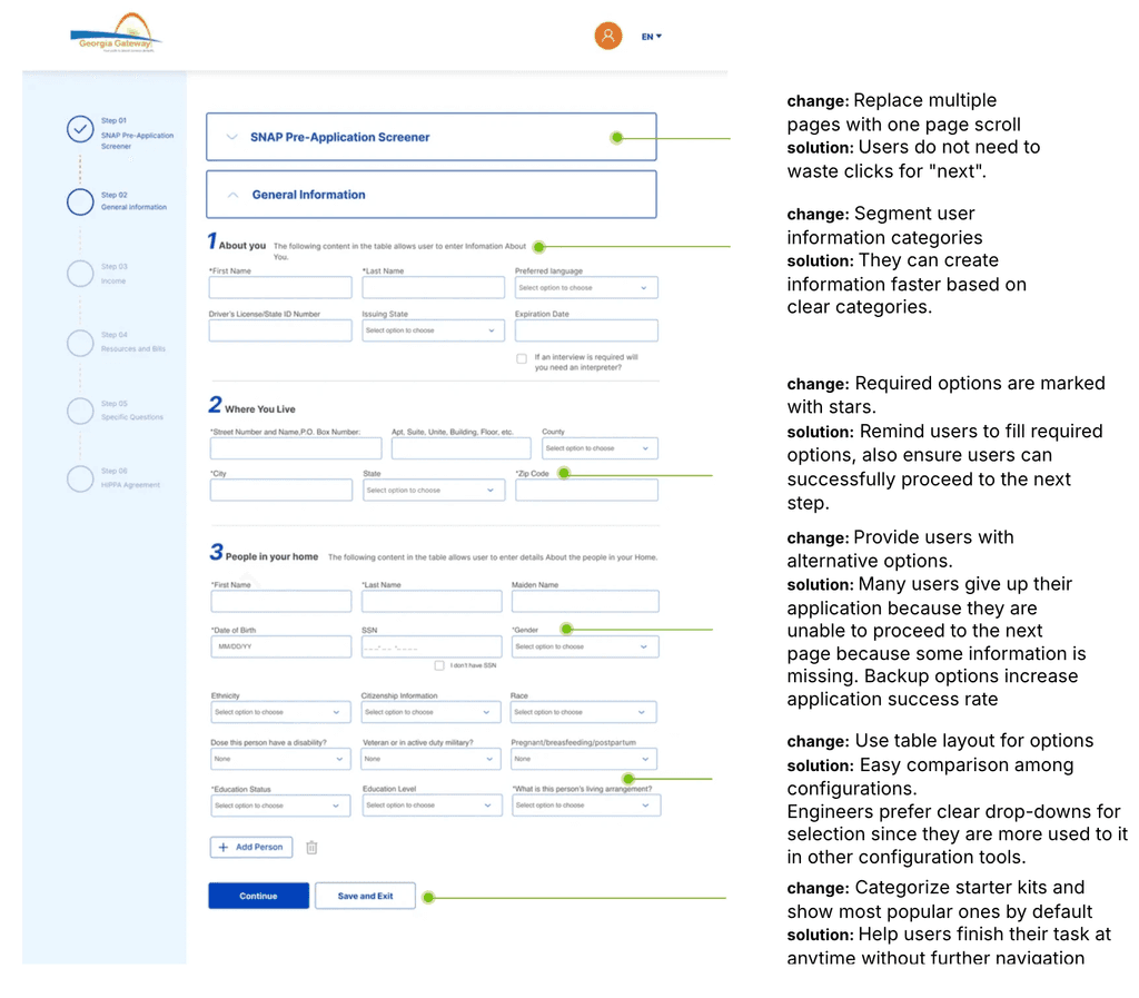
高保真应用程序流程
展示和定义
What I Learn
In my experience, I've come to realize that accessibility is an absolutely critical aspect of any project. Whether it's a website, software, or any other product, ensuring that it can be used by people of all abilities is crucial. There are strict standards set by governments and companies to ensure that website accessibility design meets certain criteria. This is because we need to cater to a diverse audience, and it's important that the user interface design and research process are incredibly thorough and logical in order to create a final design that meets these standards and is usable by everyone.


